C# and JavaScript Online Courses Coupons to start off 2021

Hello everyone,

It’s been a while since I last posted. Well, I have been busy making awesome online courses for C# and JavaScript. Kudos to my friends over at Packt

If you want to start-off 2021 with a bunch of new content on your favorite programming language check the following coupon codes for my courses:

Modern App Development with C# 8 and .NET Core 3.0

AB01630EE9B5E5AF3679

C# 8 and .NET Core 3.1 Recipes (2nd Edition)

E19DA06FEA6C5BBECF14

JavaScript Testing Best Practices

FDAB37863E307153AB68

Each coupon is valid for up to 10 redemptions before February 12 so hurry up!

Entity Framework Core Migrations with Azure Service Fabric

Entity Framework Core migrations are really powerful and most C# developers make good use of them. They’re very easy to use, you can work with them either on Powershell or on the Package Manager Console. Most of the time whenever you make some change in your Entities you can open up a terminal and hit “dotnet ef migrations add” followed by a name for your new migration.

This will work on all ASP.NET Core projects by default. However, when creating a Service Fabric Stateless or Stateful microservice, things are different. If you attempt to run this command it won’t work. You will receive an error like the following:

Unable to create an object of type ‘AppDbContext’. Add an implementation of ‘IDesignTimeDbContextFactory‘ to the project, or see https://go.microsoft.com/fwlink/?linkid=851728 for additional patterns supported at design time.

The first step to debugging this error is to re-run the command in verbose mode:

dotnet ef migrations add "InitialMigration" --verbose

By taking a closer look to the console output we can see that the actual error that broke the operation is the following exception:

System.MissingMethodException: No parameterless constructor defined for this object.

Every time you run that command without supplying any other arguments, .NET Core will re-build your project, execute Program.cs to load the webhost and more specifically the Startup file. This is important because without the startup file, it will be impossible for the runtime to know how to instantiate the Database Context.

This is an example of an AppDbContext:

We only have one entity, the ToDo model and we inherit from Entity Framework’s DbContext. If you look at the constructor, you can see that in order to create a new instance of this class we have to pass an argument of type DbContextOptions. The most common option in that object is the connection string that will allow Entity Framework to locate our database. The options object is created by a DbContextOptionsBuilder in the startup class at the time of registration like this:

So what is really happening is that the runtime can’t provide DbContextOptions so it resorts to calling the parameter-less constructor. But there’s no such thing. We haven’t implemented one. And it’s neither the best choice nor possible sometimes. So, the framework suggests we implement the IDesignTimeDbContextFactory interface. It’s not necessary, we can quickly solve this issue by adding the following lines to our Program.cs file:

This function will build a webhost and load the Startup file. That way, when .NET Core builds the project it will know how to create an instance of the DBContext because it will be registered with the ASP.NET Core Dependency Injection Container

Note that attempting to call this method from inside Main will cause your Service Fabric build to fail because it will hijack the default port 5000. Doing so will cause any subsequent microservice build to fail.

Maintain Intellisense in Express Handler Wrappers

Wrapping ExpressJS handler functions is a common practice. I especially like express handlers for catching errors in async functions and redirecting them to global Express error handling middleware.

The following is an example of such a handler:

When the passed async Request Handler fails with an exception or Promise rejection, the error will be passed to the next function and it will be sent to the first error handler in the middleware pipeline.

We can use it in our Express application like this:

This allows for centralized error handling and simple clean code with out intrusive try/catch blocks. But that’s a matter for another discussion.

The issue we face when wrapping Express request handlers is that we miss important typings for the two primary arguments, The Request and Response objects. Now unless you are still writing code in your green-text-in-black-background nano editor running on your custom build of Kali you probably take advantage of some form of auto-complete. Visual Studio Code for example offers Intellisense. Intellisense if the practice of the editor providing information for object members and function signatures to you dynamically while writing code.
Here’s a screenshot of Visual Studio code showing a list of members that can be found in the response object:

Intellisense was made with typed languages in mind so what can we do in JavaScript? (“Write TypeScript is a completely valid answer to this question and I endorse it”). Well in JavaScript, we need to work a bit more to maintain Intellisense and since we can’t just state that req is a request object and res is a response object when declaring the callback inside the wrapper we have to use code metadata and VSCode will understand.

With some simple modification in the wrapper module we can maintain Intellisense and save ourselves the headache.
First, we have to dig into Express typings. Typings are d.ts files that provide metadata for JavaScript modules. Not all libraries have them, but at least Express does. You can view Express’ typings by ctrl-clicking on a require statement that points to express:

Searching the file we can find the following:

Notice that we have to use ES6 module syntax when importing RequestHandler.

We need one last change to make this work. We need to open the async-wrapper.js file and convert our module to a named one:

Notice that we have to use ES6 module syntax when importing RequestHandler.

We need one last change to make this work. We need to open the async-wrapper.js file and convert our module to a named one:

Now if we check a file where we use AsyncWrapper, we can see that Intellisense is back.

No, async/await won’t save you from Promises

One of the most remarkable announcements of the previous year was the adoption of ES7 features by NodeJS. The release of NodeJS version 7.6.0 was followed by tremendous applause by the JavaScript community that fueled a development frenzy. JavaScript developers were convinced that not only was the callback hell gone for good, but also so were promises. And it wasn’t just backend developers that were impressed. Frontend developers working on the hottest JS framework of the week were also impressed and refactoring all of their services and asynchronous calls to go with the hype. You could suddenly hear devs whispering during meetups about this amazing new feature of async/await like if it is the holy grail of innovation (hint, C# has been supporting this feature for years).

The reason why JavaScript developers loved async/await was primarily because of the given ability to write streamlined code without having to worry about callbacks and different orders of execution. It was like ES7 lifted the responsibility of writing optimized asynchronous code off of their shoulders. Everything seems simpler if you don’t have to use callbacks and yes the function you pass to .then() is still a callback. It’s pretty obvious to every sane person out there that going from this:

To this:

Is an improvement. And certainly this:

is probably as good as it can get.

So why still bother using promises? If you were tutoring a new JavaScript developer you might as well tell them to discard promises and learn to use async/await everywhere, right? WRONG!

Promises are still useful and let’s not forget that async/await does make use of promises under the hood. Did you know that you can attach a then call at the end of an async function you will be able to run a callback after the async function terminates? Also, did you know that if you omit the ‘await’ keyword you get back a promise? So yeah, promises are here to stay and there’s one particular use case where promises can still shine.

Suppose you have a few arbitrary sensors returning some temperatures, min, max, average, that short of thing. Let’s simulate the asynchronous nature of a system like that by using setTimeout:

So, now you have 3 functions taking a few seconds to return the sensor data. The first one takes 2000ms, the second one takes 1000ms and the third one takes 3000ms.

What if we needed to have a function that takes all sensor data and performs a computation based on a formula. We would have to wait for all 3 sensors to finish. Since all 3 functions use promises and we already know the connection between promises and async/await let’s do this using the latest ES7 feature:

Using the performance interface I measured the execution time of the above function to ~6000ms (6006ms to be precise). I don’t know about you but that seems like a lot of time to me and it definitely does not feel like it’s asynchronous at all. Sure we can do better.

The following code makes use of the invaluable Promise.all function:

Promise.all takes an array of promises and returns a single promise that gets resolved when all other promises get resolved. If we use the performance.now() method one more time we can see that the execution time goes down to 3001ms. To compare the two functions you can use this fiddle (only run the fiddle in browsers that do support async/await):

If we change the third timeout’s delay from 3000ms to 4000ms and run the example the above code we see that it takes ~7000ms with async/await and ~4000ms with Promise.all, both reasonable values considering that we increased the delay by 1000ms.

It’s pretty evident that Promise.all is a better method for waiting for multiple promises to resolve but why? Well the reason stands in the order in which the async/await function calls the 3 sensor functions.

This is how the functions get called:

The getSensorAData function is called at the beginning and the getSensorBData function is not called until after getSensorAData has returned. And the same happens with getSensorCData. So we end up with a total time that is the sum of the functions’ execution times plus a few milliseconds because of the call to console.log and CPU time.

In the Promise.all approach however, all 3 functions are executed almost at the same time (not exactly the same time, remember JavaScript is single-threaded). So we end up with the following timeline:

That’s why this approach’s execution time almost matches the execution time of the function that takes the longest time to complete. A little side-note here, what you see in the image above is not multi-threading. JavaScript does not support that kind of thing. The image depicts the time it takes for each function to finish relative to its starting time. That does not mean that getSensorA, for example, occupies the browser thread for 2 seconds straight.

The improvement in execution time we achieved by using Promise.all is no small feat. In larger applications the improvement could be massive and until we are able to await multiple async functions at the same time and that feature is supported by the latest version of NodeJS and at least one transpiler, the Promise.all will be the perfect solution and the promise-based syntax will still be alive.

Anagram check in a JavaScript interview?

I was recently at a job interview for a position related to Angular and C# development. After a few questions about design patterns and CSS I was finally asked to code something. I was never one to dislike technical interviews, even the whiteboard ones. Because I know that interviewers value the thought process more than the actual result. I know. I’ve been there.

But what surprised me was that the task at hand had nothing to do with Angular or C#. Instead it was a traditional interview question regarding anagrams.

So the interviewer asked me to code a function that would check if two strings are anagrams of each other.

The strategy when faced with a task like that is to first ask your interviewer some questions that you may have regarding the problem. If you don’t have any questions it’s always nice to repeat the problem back to your interviewer. Remember, they’re not just after your impressive coding skills, they want to see you’re equally able to communicate, an area in which quite a lot of developers are inferior.

After showing that you can communicate effectively, it’s time to analyze the problem. Again it’s imperative that you think out loud. If you sit silent staring at the keyboard, or the white board depending on your situation, two things will happen. First, you may be synthesizing the most architecturally and algorithmically perfect solution based on your impeccable skills and incomparable experience, but the interviewer might as well think that you’ve frozen. So, again, communicate. The second thing that’s gonna happen is that if you haven’t figured out the solution, anxiety will eventually cripple you. By talking you get your brain to start thinking. You can’t go from “completely frozen” to “devising the perfect algorithm” just like you can’t get your car from stationery to running at 200km/h in a second’s time.

Don’t attempt to arrive to the optimal solution on first try. Start by finding something that works. In the case of the anagram problem, the first possible solution that I mentioned was to create a “dictionary” for storing each letter in each word along with the number of times that the letter appears within the word. So of we have the strings “baba” and “abba” the we would have two equivalent objects like this:

Literally five seconds after recommending that solution to the interviewer, an actual better solution came to my mind. I would sort the two strings and then compare them. If they’re equal then we have an anagram.

The final touch that I added was an initial check of the strings’ lengths. If the strings don’t have equal lengths then we can immediately return false because we can be absolutely certain that the strings are not anagrams of each other.

The final algorithm after optimizations looks like this:

A fairly simplistic approach with chained calls to split, sort and join to enhance readability.

That’s it for today. I hope you found this answer to a common interview question helpful. See you next time.

How to properly center CSS pseudo elements

Pseudo elements are great when you want to add that something that will make your page or app shine. There times though when you want to center those before or after pseudo elements and using percentages doesn’t do it. Going with the plain old margin: auto trick or using flexbox doesn’t quite work either. In this quick post I’m going to explain how you can perfectly style your pseudo element and be sure that it will work no matter the resolution or font-size or whatever.

Let’s say that we want to create a button like this one below. It kind of looks like an eye.

eye1

Obviously we need to first design the outer circle. Let’s make something big and go for 250 pixels:

width: 250px;
height: 250px;

We want it round so let’s also add 100% border radius:

border-radius: 100%;

White background:

background-color: white;

We will be absolutely positioning a pseudo element later so we need the container element to be positioned relatively:

position: relative;

A subtle border:

border-style: solid;
border-width: 1px;
border-color: #e8eef6;

When it comes to borders I generally try to avoid the shorthand notation because to me it seems easier to comprehend when the properties span different lines.

Also, a subtle box shadow created shamelessly using the Chrome Dev Tools:

box-shadow: 0 0 6px 1px #e8eef6;

And let’s add some typical margin:

margin: 12px;

So with those rules in place you will be getting something like this:

eye2

We’re done with the easy part, we’ve successfully designed the outer circle. Now to the inner one.

Let’s set the size of the inner circle to 50 pixels and use a variation of blue for its background color:

 content: "";
 position: absolute;
 width: 50px;
 height: 50px;
 background-color: #1c5ba2;
 border-radius: 100%; 

Now before doing anything else, if we check the result we have this monstrosity:

eye4

The inner circle naturally resides on the upper left corner of the container element. We need to move it so let’s use the top and left properties:

left: 50%;
top: 50%;

eye5

Well.. It’s actually better than before but we’re nowhere near our desired end result. But why is this happening you might ask? We used percentages right? 50% from the top and 50% percent from the left should be enough to place this pseudo element right at the center of its container. Well this may sound reasonable but it isn’t if you know the internal details of how CSS works. You see, this would work fine if top: 50% meant “Place the center of the pseudo element 50% from the top” and left 50% meant “Place the center of the pseudo element 50% from the left”.

But what top: 50% actually means is: “Place the pseudo element’s 50% from the top” and left: 50% means “Place the pseudo-element’s left-most point 50% from the left”. That’s how CSS works. That’s why the inner circle was placed on the upper left corner of the container element before we moved it. Elements are placed from left to right and from top to bottom.

The solution to this will be to move the center of the inner circle to the center of the outer circle. We can do that by using negative margins. We’ve defined the pseudo-element’s size (width = height since this is a round element) equal to 50pixels. That means the element’s center, the circle’s center is 50/2 =25px from the left and 50/2 = 25 25 pixels from the top. We can add those numbers as negative margins:

margin-top: -25px;
margin-left: -25px;

And poof! Problem solved!

eye1

Bonus: If you’re using a CSS pre-compiler like Sass you can take it one step further and only have one single number that describes your shape. The outer circle’s size. Everything else can be computed using mathematical operations. Check the following fiddle for more on this:

How to add Bootstrap to Karma in Angular 4

Karma is a wonderful JavaScript test runner that starts a browser and displays everything you need to know about your test suite. Successful tests, Failed tests, pending tests. Everything. But what makes it really powerful is its ability to also display the component you’re testing each time. It’s also the default task runner for Angular CLI projects.

The thing is though, that the default Angular project created by the CLI does not include any CSS frameworks you may be using, like Bootstrap for example. Custom component styles are included if you’ve added them to the styleUrls array in your component decorator like this

@Component({
    selector: 'app-buttons-area',
    templateUrl: './buttons-area.component.html',
    styleUrls: ['./buttons-area.component.css']
})

In this example we have an app-buttons-area component that comes with some custom styles written exclusively in buttons-area.component.css

But most of the time your custom styles are complementary to more global styling either in the form of a CSS Framework like Bootstrap or Foundation, or in a global styles.css file that you may compile from Sass sources. Karma does not include those styles when producing the end result.

The good news is that it’s very easy to include them yourself. In this example we’re going to add Bootstrap’s css that we have installed using npm but you can do the same with your custom styles.

In the buttons-area.component.html we have three buttons styled exclusively using Bootstrap 4 classes:

<div class="row">
    <div class="col">
        <button class="btn btn-primary" (click)="btn1Clicked()">Button 1</button>
        <button class="btn btn-success" (click)="btn2Clicked()">Button 2</button>
        <button class="btn btn-danger" (click)="btn3Clicked()">Button 3</button>
    </div>
</div>
<div class="row">
    <div class="col">
        <span>{{output}}</span>
    </div>
</div>

But if we run the test using ng test we get this:

karma-before

The buttons don’t look quite like we expected them to look.

To fix that we need to open the karma.config.js file. If you’re using the CLI, that file resides in your project’s root directory

Open it, find the call to config.set(), scroll down to the end of it and add a files array like this:

files: [
    './node_modules/bootstrap/dist/css/bootstrap.min.css'
]

The path may be different of course if you’re not including bootstrap via npm (although I strongly recommend it) or if you’re using another CSS framework.

So you end up with a karma.config.js like this:

// Karma configuration file, see link for more information
// https://karma-runner.github.io/0.13/config/configuration-file.html

module.exports = function (config) {
  config.set({
    basePath: '',
    frameworks: ['jasmine', '@angular/cli'],
    plugins: [
      require('karma-jasmine'),
      require('karma-chrome-launcher'),
      require('karma-jasmine-html-reporter'),
      require('karma-coverage-istanbul-reporter'),
      require('@angular/cli/plugins/karma')
    ],
    client:{
      clearContext: false // leave Jasmine Spec Runner output visible in browser
    },
    coverageIstanbulReporter: {
      reports: [ 'html', 'lcovonly' ],
      fixWebpackSourcePaths: true
    },
    angularCli: {
      environment: 'dev'
    },
    reporters: ['progress', 'kjhtml'],
    port: 9876,
    colors: true,
    logLevel: config.LOG_INFO,
    autoWatch: true,
    browsers: ['Chrome'],
    singleRun: false,
    files: [
      './node_modules/bootstrap/dist/css/bootstrap.min.css'
    ]
  });
};

Again this is with the default setup configured by the CLI. Now if we re-run the tests

karma-after

That’s it. It was pretty easy. Keep coding 😉

Using the HttpClient the correct way

The other day I was building a small demo ASP.NET Core 2.0 application for the purposes of a video course I’m preparing on the upcoming second version of .NET Core.

The application was making several http requests to third party APIs. I noticed that it was taking unusually long to finish. At first I thought that something was wrong with the preview version of .NET Core and curious to find out why I ported it to the stable .NET Core 1.1 and started filling the code with stopwatches to discover the source of the lag.

What I found out was that I have been using the HttpClient all wrong. And probably so do you. All the countless C# books, tutorials and courses out there all mention that the correct usage of the HttpClient is withing a ”using’ statement.

The flow of this thought goes something like this: The HttpClient holds unmanaged resources, it also implement the IDisposable interface. When it comes to other IDisposables like the StreamReader we wrap them in ‘using’ statements so we should do the same with HttpClient.

The problem is, that’s not the case! Creating a new instance of the HttpClient every time we make a request and disposing it after the request completes is not the most sensible thing to do as it turns out. You’re better off having a single HttpClient instance. You can achieve this by creating a wrapper for the HttpClient and either declare it as static or register it as a singleton with your preferred IoC container. The second solution seems more elegant and avoids the static cling code smell.

But let’s take it from the beginning. After the discovering what made my application so slow, I figured I could run a test. So I created a .NET Core Console Applciation from scratch. I then went on to creating two classes, the SlowWay and the FastWay static classes. (I know, awful names). Both classes make several requests to this url: http://jsonplaceholder.typicode.com/photos.

The SlowWay classes follows the famous ‘using’ convention. The FastWay class uses the same HttpClient for all requests

And here’s how I tested them:

With the RequestCount set to 30 I got the following results:

blog1

The slow approach takes almost double the time, something that proves my fears about the ‘using’ statement

Increasing the RequestCount to 30 results in almost triple performance decrease:

blog2

Increasing to 60 got me even closer to 3 times increase in performance improvement when using the fast approach.

Imagine the performance increase that little modification can lead to in Microservices Oriented Applications.

After digging around the internet for quite some time I stumbled upon an awesome article that describes the source of the issue. Apparently, it’s a TCP socket issue. Check the article from ASP.NET Monsters for more information.

Oh and stop wrapping your HttpClients in ‘using’ statements when making multiple requests. I certainly will.

The whole project is available in this repo: https://github.com/dimlucas/HttpClientPerformanceTest

Flexible tabs in Vue.js [Part 2]

In the first part of this tutorial I showed you how easy it is to create a tabbed menu that changes dynamically using Vue.js.

We created the tab data, we implemented the tab swapping functionality and it’s now time to see how to add new tabs, edit the name of the tabs we have added and removing tabs.

Add New Tab
Let’s start by adding a new tab.

As you can see, nothing really happens when we click on the button that’s supposed to add a new tab. Let’s change that.

We’ll begin by adding a new method in the methods object. We’ll call it addNewTab.


addNewTab: function() {
    let newId = this.tabs[this.tabs.length - 1].id + 1;
    this.tabs.push({
        id: newId,
        title: `Tab ${newId}`,
        content: {
            header: 'New Tab Header',
            content: 'New tab contents'
        },
        editMode: false
    });
    this.activateTab(this.tabs[this.tabs.length - 1]);
},

The addNewTab method is responsible for finding the id of the new tab. It does that by incrementing the id of the last tab in the array. Next the only thing we have to add is push a new tab object in the tabs array. We don’t need to perform any other action to update the view. The Vue.js engine will pick up the change and will automatically add a new tab for us. The call to activateTab will also cause navigation to the new tab. Remember that an important principle of UI/UX design is that your application should feel natural to the user and the actions the user has to take must be similar to actions in other applications. So when users use a browser, they know that when they’re opening a new empty tab they will directed to it. That’s what we have to do to in our application too in order to take advantage of the user’s memory.

We need one more step to make this work. We need to call the method when the user clicks on the add button


<button class="icon-btn" v-on:click="addNewTab()">
    <i class="fa fa-plus" aria-hidden="true"></i>
</button>

Edit / Rename Tab

Now when organizing your data in tabs you may need to rename them to something more meaningful. Especially if we’re talking about a new tab. There are a few ways in which we can trigger the renaming process. We could put one more icon next to the x icon. Like a pencil icon or something like that. A font awesome icon will serve this purpose.

 <li v-for="tab of tabs" class="nav-item">
    <a v-bind:class="{'nav-link d-flex align-items-center tab': true, 'active': (tab.id == activeTab.id) }" href="#" v-on:click="activateTab(tab)">
        <span class="mr-5" v-show="!tab.editMode">{{tab.title}}</span>
        <input class="form-control" type="text" v-show="tab.editMode" placeholder="Tab Name" v-model="tab.title">
        <button class="icon-btn">
            <i class="fa fa-pencil" aria-hidden="true"></i>
        </button>
        <button class="icon-btn">
            <i class="fa fa-times" aria-hidden="true"></i>
        </button>
    </a>
</li>

I’ve also added some margin to separate the tab’s title from the buttons and changed the CSS that styled the x button to also target the pencil:

.fa {
    opacity: 0.54;
    transition: color $color-transition-duration;
    
    &:hover {
        color: $x-hover-color;
    }
}  

(The target class used to be .fa-times)

We will also need a text box that will only be visible when our tab is in edit mode. So let’s create a text input right under the tab’s title that will only be visible when the ‘editMode’ property of the tab object exists and is set to true.

<input class="form-control" type="text" v-show="tab.editMode" placeholder="Tab Name" v-model="tab.title">

Now we have to add one more property to our tab objects, the editMode property that will be set to false by default:

this.tabs.push({
    id: newId,
    title: `Tab ${newId}`,
    content: {
        header: 'New Tab Header',
        content: 'New tab contents'
    },
    editMode: false
});

After adding the editMode property we will need a way to set it to true. So we can add a method called ‘editTabName’ to our view model. That method will accept a tab object as an argument and it will set its editMode property to true. That way, the text box will appear every time we click on the pencil button

editTabName: function(tab){
    tab.editMode = true;
}

And of course we need to call the method from our view on the ‘click’ event:

<button class="icon-btn" v-on:click="editTabName(tab)">
    <i class="fa fa-pencil" aria-hidden="true"></i>
</button>

The ‘editTabName’ method turns the edit mode on:

editTabName: function(tab){
    tab.editMode = true;
}

And we also need way to turn it off. That’s why we need an extra button that will replace the pencil when editMode is active:

<button class="icon-btn" v-show="!tab.editMode" v-on:click="editTabName(tab)">
    <i class="fa fa-pencil" aria-hidden="true"></i>
</button>
<button class="icon-btn" v-show="tab.editMode" v-on:click="acceptEdit(tab)">
    <i class="fa fa-check" aria-hidden="true"></i>
</button>

The ‘acceptEdit’ method will just turn the edit mode off. Everything else is taken care of by Vue. We do not need to get the text from the textbox since we’ve used model binding:

acceptEdit: function(tab) {
tab.editMode = false;
}

Deleting a tab

The deletion process is pretty simple. We ‘re just filtering out the deleted tab:

deleteTab: function(tab) {
    this.tabs = this.tabs.filter(t => t.id != tab.id);
}

Of course you have to make sure that you call the method when the delete button is clicked passing it the tab to delete.

Aaaand we have a fully functional tabbed menu with Vue.js. The code is open to modification that can make it adapt to your needs and it’s a nice place to start.

The complete JSFiddle:

Flexible tabs in VueJS [Part 1]

Hello everyone. In this post I’m going to show you how to create a tabbed navigation in VueJS. Tabs are a very flexible and easy way to switch between content. Users are very accustomed with them because, well, they use them already. In their browsers! Working with a tabbed layout is even easier with Vue.

To speed things up and reduce the time spent styling the tabs we are going to use Bootstrap 4. At the time of this writing, Bootstrap 4 is still in alpha version but it’s very stable and brings in some powerful new features. So I’ve ditched Bootstrap 3 in favor of its newer edition. After adding Bootstrap 4 let’s create 3 simple tabs using the ‘nav-tabs’ Bootstrap class:

<div class="container-fluid">
    <div class="row">
        <div class="col-12">
            <ul class="nav nav-tabs">
                <li class="nav-item">
                    <a class="nav-link active" href="#">Tab 1</a>
                </li>
                <li class="nav-item">
                    <a class="nav-link" href="#">Tab 2</a>
                </li>
                <li class="nav-item">
                    <a class="nav-link" href="#">Tab 3</a>
                </li>
            </ul>
        </div>
    </div>
</div>

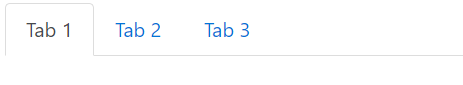
You can see the result we get is very satisfying, taking into account the amount of code we had to write to produce this.

tabblog1

Now that we’ve created the tabs we need a way to fill in their contents. The best tool for this job is a Bootstrap card

So let’s place the following code snippet right under our tabs:

<div class="card tab-contents">
    <div class="card-block">
        <div class="card-title">
            Tab Contents here
        </div>
    </div>
</div>

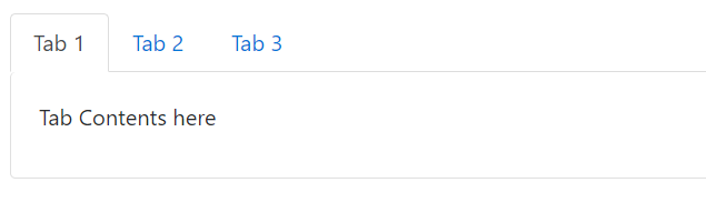
The result is almost perfect:tabblog2

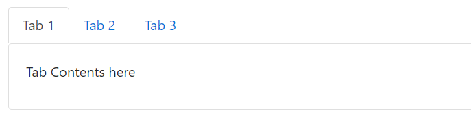
We need to remove this ugly line under the active tab so that our design can be a little bit more fluent and consistent.

.card.tab-contents {
    border-top: none;
}

Much better now:

tabblog3

Bootstrap gives us a stylistic starting point. But I think we have to improve our tabs to give them a more unique look and feel. To do that I changed some things in the HTML and I’ve added the following Sass styles and a font awesome icon on each tab that will serve as a ‘close button’. I’ve also made each tab a flex container, so that everything is aligned properly within it. A flex container will also be useful to us later when we will add a text box for renaming the tab

HTML:

<div class="container-fluid">
    <div class="row">
        <div class="col-12">
            <ul class="nav nav-tabs">
                <li class="nav-item">
                    <a class="nav-link d-flex align-items-center active tab" href="#">
                        <span>Tab 1</span>
                        <button class="icon-btn">
                            <i class="fa fa-times" aria-hidden="true"></i>
                        </button>
                    </a>
                </li>
                <li class="nav-item">
                    <a class="nav-link d-flex align-items-center tab" href="#">
                        <span>Tab 2</span>
                        <button class="icon-btn">
                            <i class="fa fa-times" aria-hidden="true"></i>    
                        </button>
                    </a>
                </li>
                <li class="nav-item">
                    <a class="nav-link d-flex align-items-center tab" href="#">
                        <span>Tab 3</span>
                        <button class="icon-btn">
                            <i class="fa fa-times" aria-hidden="true"></i>
                        </button>
                    </a>
                </li>
            </ul>
            <div class="card tab-contents">
                <div class="card-block">
                    <div class="card-title">
                        Tab Contents here
                    </div>
                </div>
            </div>
        </div>
    </div>
</div>

Sass:

$color-transition-duration: 0.8s;
$accent-color: #2980b9;
$x-hover-color: #c0392b;
$smaller-nav-item-padding: 8px;
$icon-size: 0.875rem;

ul.nav-tabs {
    margin-top: 12px;
}

.card.tab-contents {
    border-top: none;
    border-radius: 0;
} 

.nav-link.tab {
    border-radius: 0;
    
    //Override the 16px Bootstrap default to give it a more tab-like feel
    padding-right: $smaller-nav-item-padding;
    
    span {
        transition: color $color-transition-duration;    
        color: black;
        opacity: 0.54;
        &:hover {
            color: $accent-color;
        }
    }
    
    &.active {
        span {
            opacity: 1;
        }
    }
           
    .icon-btn {
        margin-left: 6px;
        text-decoration: none;    
        background-color: transparent;
        border: none;
        cursor: pointer;
        outline: none;
        font-size: $icon-size;

        .fa-times {
            opacity: 0.54;
            transition: color $color-transition-duration;
            
            &:hover {
                color: $x-hover-color;
            }
        }    
    }    
}

I’ve added some top margin, made the borders rectangular, grayed out the inactive tabs and added a nice transition. Nothing fancy, with enough room for further customization.

One last thing we are going to need is an additional button that will open up a new tab

<li class="nav-item">
    <a class="nav-link d-flex align-items-center tab add-btn" href="#">
        <button class="icon-btn">
            <i class="fa fa-plus" aria-hidden="true"></i>
        </button>
    </a>
</li>

And its styles:

.nav-link.tab {
	&.add-btn {
        padding-left: $smaller-nav-item-padding;        
        
        .icon-btn {
            color: $accent-color;
            margin: 0;    
        }
    }
}

Now that we’ve built the HTML/CSS part we need to move to the actual logic that will allow our tabs to work.

We will create a VueJS view model, add an array of objects where each objects represents a tab and we will dynamically load the tabs and their content on screen. We will also need an activeTab object to store the selected tab which by default will be the first one. All these requirements are expressed in the following view model:

JavaScript:

let app = new Vue({
	el: '#app',
    data: {
    	activeTab: null,
    	tabs: [
        	{
            	id: 1,
            	title: 'Tab 1',
                content: {
                	header: 'Tab 1 Header',
                    content: 'Tab 1 Content: Lorem ipsum dolor sit amet, consectetur adipiscing elit'
                }
            },
            {
            	id: 2,
            	title: 'Tab 2',
                content: {
                	header: 'Tab 2 Header',
                    content: 'Tab 2 Content: Praesent feugiat aliquam odio, at dictum nibh. Ut vitae quam nec nunc rhoncus sodales. In luctus venenatis auctor'
                }
            },
            {
            	id: 3,
            	title: 'Tab 3',
                content: {
                	header: 'Tab 3 Header',
                    content: 'Tab 3 Content:  Praesent consectetur luctus tortor vel feugiat. Vestibulum vitae tempor ipsum, quis pharetra augue. '
                }
            }
        ]
    },
    created: function() {
    	this.activeTab = this.tabs[0];
    }
})

Now that we can dynamically load our tabs, the view greatly simplifies:

HTML:

<div id="app" class="container-fluid" v-cloak>
    <div class="row">
        <div class="col-12">
            <ul class="nav nav-tabs">
                <li v-for="tab of tabs" class="nav-item">
                    <a v-bind:class="{'nav-link d-flex align-items-center tab': true, 'active': (tab.id == activeTab.id) }" href="#">
                        <span>{{tab.title}}</span>
                        <button class="icon-btn">
                            <i class="fa fa-times" aria-hidden="true"></i>
                        </button>
                    </a>
                </li>
                <li class="nav-item">
                    <a class="nav-link d-flex align-items-center tab add-btn" href="#">
                        <button class="icon-btn">
                            <i class="fa fa-plus" aria-hidden="true"></i>
                        </button>
                    </a>
                </li>
            </ul>
            <div class="card tab-contents">
                <div class="card-block">
                    <div class="card-title">
                        {{activeTab.content.header}}
                    </div>
                    <div class="card-text">
                        {{activeTab.content.content}}
                    </div>
                </div>
            </div>
        </div>
    </div>
</div>

As you can see we have a v-for loop that populates a template of an li with all the information about the tab. Check the created() method, which is a Vue lifecycle hook called immediately after the view model is initialized. There we make activeTab point, by default, to the first tab

Next, we want a way to cycle through tabs, select one and view its contents. So basically ,we need to change the activeTab whenever we click on a tab and Vue will take care of the rest. To do that we create an ‘activateTab’ in our methods object with just one line of code:

activateTab: function(tab) {
       this.activeTab = tab;
}

Now we only need to handle the event click in the view and pass the tab object to activateTab like this:

 v-on:click="activateTab(tab)"

So our list item template now looks like this:

<li v-for="tab of tabs" class="nav-item">
    <a v-bind:class="{'nav-link d-flex align-items-center tab': true, 'active': (tab.id == activeTab.id) }" href="#" v-on:click="activateTab(tab)">
        <span>{{tab.title}}</span>
        <button class="icon-btn">
            <i class="fa fa-times" aria-hidden="true"></i>
        </button>
    </a>
</li>

You can check the code from the first part of this tutorial in the following fiddle:

In the next part of this tutorial, I’m going to show you how to add, edit and delete tabs. Stay tuned!