Flexible tabs in Vue.js [Part 2]

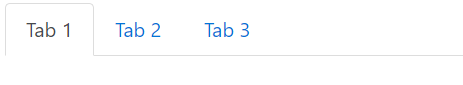
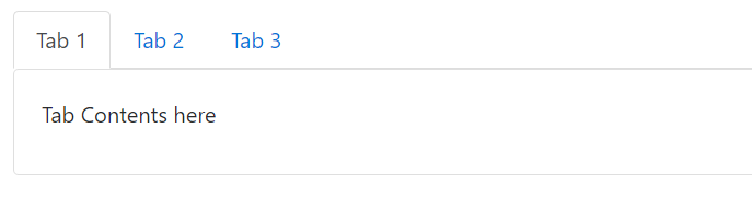
In the first part of this tutorial I showed you how easy it is to create a tabbed menu that changes dynamically using Vue.js.

We created the tab data, we implemented the tab swapping functionality and it’s now time to see how to add new tabs, edit the name of the tabs we have added and removing tabs.

Add New Tab
Let’s start by adding a new tab.

As you can see, nothing really happens when we click on the button that’s supposed to add a new tab. Let’s change that.

We’ll begin by adding a new method in the methods object. We’ll call it addNewTab.


addNewTab: function() {
    let newId = this.tabs[this.tabs.length - 1].id + 1;
    this.tabs.push({
        id: newId,
        title: `Tab ${newId}`,
        content: {
            header: 'New Tab Header',
            content: 'New tab contents'
        },
        editMode: false
    });
    this.activateTab(this.tabs[this.tabs.length - 1]);
},

The addNewTab method is responsible for finding the id of the new tab. It does that by incrementing the id of the last tab in the array. Next the only thing we have to add is push a new tab object in the tabs array. We don’t need to perform any other action to update the view. The Vue.js engine will pick up the change and will automatically add a new tab for us. The call to activateTab will also cause navigation to the new tab. Remember that an important principle of UI/UX design is that your application should feel natural to the user and the actions the user has to take must be similar to actions in other applications. So when users use a browser, they know that when they’re opening a new empty tab they will directed to it. That’s what we have to do to in our application too in order to take advantage of the user’s memory.

We need one more step to make this work. We need to call the method when the user clicks on the add button


<button class="icon-btn" v-on:click="addNewTab()">
    <i class="fa fa-plus" aria-hidden="true"></i>
</button>

Edit / Rename Tab

Now when organizing your data in tabs you may need to rename them to something more meaningful. Especially if we’re talking about a new tab. There are a few ways in which we can trigger the renaming process. We could put one more icon next to the x icon. Like a pencil icon or something like that. A font awesome icon will serve this purpose.

 <li v-for="tab of tabs" class="nav-item">
    <a v-bind:class="{'nav-link d-flex align-items-center tab': true, 'active': (tab.id == activeTab.id) }" href="#" v-on:click="activateTab(tab)">
        <span class="mr-5" v-show="!tab.editMode">{{tab.title}}</span>
        <input class="form-control" type="text" v-show="tab.editMode" placeholder="Tab Name" v-model="tab.title">
        <button class="icon-btn">
            <i class="fa fa-pencil" aria-hidden="true"></i>
        </button>
        <button class="icon-btn">
            <i class="fa fa-times" aria-hidden="true"></i>
        </button>
    </a>
</li>

I’ve also added some margin to separate the tab’s title from the buttons and changed the CSS that styled the x button to also target the pencil:

.fa {
    opacity: 0.54;
    transition: color $color-transition-duration;
    
    &:hover {
        color: $x-hover-color;
    }
}  

(The target class used to be .fa-times)

We will also need a text box that will only be visible when our tab is in edit mode. So let’s create a text input right under the tab’s title that will only be visible when the ‘editMode’ property of the tab object exists and is set to true.

<input class="form-control" type="text" v-show="tab.editMode" placeholder="Tab Name" v-model="tab.title">

Now we have to add one more property to our tab objects, the editMode property that will be set to false by default:

this.tabs.push({
    id: newId,
    title: `Tab ${newId}`,
    content: {
        header: 'New Tab Header',
        content: 'New tab contents'
    },
    editMode: false
});

After adding the editMode property we will need a way to set it to true. So we can add a method called ‘editTabName’ to our view model. That method will accept a tab object as an argument and it will set its editMode property to true. That way, the text box will appear every time we click on the pencil button

editTabName: function(tab){
    tab.editMode = true;
}

And of course we need to call the method from our view on the ‘click’ event:

<button class="icon-btn" v-on:click="editTabName(tab)">
    <i class="fa fa-pencil" aria-hidden="true"></i>
</button>

The ‘editTabName’ method turns the edit mode on:

editTabName: function(tab){
    tab.editMode = true;
}

And we also need way to turn it off. That’s why we need an extra button that will replace the pencil when editMode is active:

<button class="icon-btn" v-show="!tab.editMode" v-on:click="editTabName(tab)">
    <i class="fa fa-pencil" aria-hidden="true"></i>
</button>
<button class="icon-btn" v-show="tab.editMode" v-on:click="acceptEdit(tab)">
    <i class="fa fa-check" aria-hidden="true"></i>
</button>

The ‘acceptEdit’ method will just turn the edit mode off. Everything else is taken care of by Vue. We do not need to get the text from the textbox since we’ve used model binding:

acceptEdit: function(tab) {
tab.editMode = false;
}

Deleting a tab

The deletion process is pretty simple. We ‘re just filtering out the deleted tab:

deleteTab: function(tab) {
    this.tabs = this.tabs.filter(t => t.id != tab.id);
}

Of course you have to make sure that you call the method when the delete button is clicked passing it the tab to delete.

Aaaand we have a fully functional tabbed menu with Vue.js. The code is open to modification that can make it adapt to your needs and it’s a nice place to start.

The complete JSFiddle:

Flexible tabs in VueJS [Part 1]

Hello everyone. In this post I’m going to show you how to create a tabbed navigation in VueJS. Tabs are a very flexible and easy way to switch between content. Users are very accustomed with them because, well, they use them already. In their browsers! Working with a tabbed layout is even easier with Vue.

To speed things up and reduce the time spent styling the tabs we are going to use Bootstrap 4. At the time of this writing, Bootstrap 4 is still in alpha version but it’s very stable and brings in some powerful new features. So I’ve ditched Bootstrap 3 in favor of its newer edition. After adding Bootstrap 4 let’s create 3 simple tabs using the ‘nav-tabs’ Bootstrap class:

<div class="container-fluid">
    <div class="row">
        <div class="col-12">
            <ul class="nav nav-tabs">
                <li class="nav-item">
                    <a class="nav-link active" href="#">Tab 1</a>
                </li>
                <li class="nav-item">
                    <a class="nav-link" href="#">Tab 2</a>
                </li>
                <li class="nav-item">
                    <a class="nav-link" href="#">Tab 3</a>
                </li>
            </ul>
        </div>
    </div>
</div>

You can see the result we get is very satisfying, taking into account the amount of code we had to write to produce this.

tabblog1

Now that we’ve created the tabs we need a way to fill in their contents. The best tool for this job is a Bootstrap card

So let’s place the following code snippet right under our tabs:

<div class="card tab-contents">
    <div class="card-block">
        <div class="card-title">
            Tab Contents here
        </div>
    </div>
</div>

The result is almost perfect:tabblog2

We need to remove this ugly line under the active tab so that our design can be a little bit more fluent and consistent.

.card.tab-contents {
    border-top: none;
}

Much better now:

tabblog3

Bootstrap gives us a stylistic starting point. But I think we have to improve our tabs to give them a more unique look and feel. To do that I changed some things in the HTML and I’ve added the following Sass styles and a font awesome icon on each tab that will serve as a ‘close button’. I’ve also made each tab a flex container, so that everything is aligned properly within it. A flex container will also be useful to us later when we will add a text box for renaming the tab

HTML:

<div class="container-fluid">
    <div class="row">
        <div class="col-12">
            <ul class="nav nav-tabs">
                <li class="nav-item">
                    <a class="nav-link d-flex align-items-center active tab" href="#">
                        <span>Tab 1</span>
                        <button class="icon-btn">
                            <i class="fa fa-times" aria-hidden="true"></i>
                        </button>
                    </a>
                </li>
                <li class="nav-item">
                    <a class="nav-link d-flex align-items-center tab" href="#">
                        <span>Tab 2</span>
                        <button class="icon-btn">
                            <i class="fa fa-times" aria-hidden="true"></i>    
                        </button>
                    </a>
                </li>
                <li class="nav-item">
                    <a class="nav-link d-flex align-items-center tab" href="#">
                        <span>Tab 3</span>
                        <button class="icon-btn">
                            <i class="fa fa-times" aria-hidden="true"></i>
                        </button>
                    </a>
                </li>
            </ul>
            <div class="card tab-contents">
                <div class="card-block">
                    <div class="card-title">
                        Tab Contents here
                    </div>
                </div>
            </div>
        </div>
    </div>
</div>

Sass:

$color-transition-duration: 0.8s;
$accent-color: #2980b9;
$x-hover-color: #c0392b;
$smaller-nav-item-padding: 8px;
$icon-size: 0.875rem;

ul.nav-tabs {
    margin-top: 12px;
}

.card.tab-contents {
    border-top: none;
    border-radius: 0;
} 

.nav-link.tab {
    border-radius: 0;
    
    //Override the 16px Bootstrap default to give it a more tab-like feel
    padding-right: $smaller-nav-item-padding;
    
    span {
        transition: color $color-transition-duration;    
        color: black;
        opacity: 0.54;
        &:hover {
            color: $accent-color;
        }
    }
    
    &.active {
        span {
            opacity: 1;
        }
    }
           
    .icon-btn {
        margin-left: 6px;
        text-decoration: none;    
        background-color: transparent;
        border: none;
        cursor: pointer;
        outline: none;
        font-size: $icon-size;

        .fa-times {
            opacity: 0.54;
            transition: color $color-transition-duration;
            
            &:hover {
                color: $x-hover-color;
            }
        }    
    }    
}

I’ve added some top margin, made the borders rectangular, grayed out the inactive tabs and added a nice transition. Nothing fancy, with enough room for further customization.

One last thing we are going to need is an additional button that will open up a new tab

<li class="nav-item">
    <a class="nav-link d-flex align-items-center tab add-btn" href="#">
        <button class="icon-btn">
            <i class="fa fa-plus" aria-hidden="true"></i>
        </button>
    </a>
</li>

And its styles:

.nav-link.tab {
	&.add-btn {
        padding-left: $smaller-nav-item-padding;        
        
        .icon-btn {
            color: $accent-color;
            margin: 0;    
        }
    }
}

Now that we’ve built the HTML/CSS part we need to move to the actual logic that will allow our tabs to work.

We will create a VueJS view model, add an array of objects where each objects represents a tab and we will dynamically load the tabs and their content on screen. We will also need an activeTab object to store the selected tab which by default will be the first one. All these requirements are expressed in the following view model:

JavaScript:

let app = new Vue({
	el: '#app',
    data: {
    	activeTab: null,
    	tabs: [
        	{
            	id: 1,
            	title: 'Tab 1',
                content: {
                	header: 'Tab 1 Header',
                    content: 'Tab 1 Content: Lorem ipsum dolor sit amet, consectetur adipiscing elit'
                }
            },
            {
            	id: 2,
            	title: 'Tab 2',
                content: {
                	header: 'Tab 2 Header',
                    content: 'Tab 2 Content: Praesent feugiat aliquam odio, at dictum nibh. Ut vitae quam nec nunc rhoncus sodales. In luctus venenatis auctor'
                }
            },
            {
            	id: 3,
            	title: 'Tab 3',
                content: {
                	header: 'Tab 3 Header',
                    content: 'Tab 3 Content:  Praesent consectetur luctus tortor vel feugiat. Vestibulum vitae tempor ipsum, quis pharetra augue. '
                }
            }
        ]
    },
    created: function() {
    	this.activeTab = this.tabs[0];
    }
})

Now that we can dynamically load our tabs, the view greatly simplifies:

HTML:

<div id="app" class="container-fluid" v-cloak>
    <div class="row">
        <div class="col-12">
            <ul class="nav nav-tabs">
                <li v-for="tab of tabs" class="nav-item">
                    <a v-bind:class="{'nav-link d-flex align-items-center tab': true, 'active': (tab.id == activeTab.id) }" href="#">
                        <span>{{tab.title}}</span>
                        <button class="icon-btn">
                            <i class="fa fa-times" aria-hidden="true"></i>
                        </button>
                    </a>
                </li>
                <li class="nav-item">
                    <a class="nav-link d-flex align-items-center tab add-btn" href="#">
                        <button class="icon-btn">
                            <i class="fa fa-plus" aria-hidden="true"></i>
                        </button>
                    </a>
                </li>
            </ul>
            <div class="card tab-contents">
                <div class="card-block">
                    <div class="card-title">
                        {{activeTab.content.header}}
                    </div>
                    <div class="card-text">
                        {{activeTab.content.content}}
                    </div>
                </div>
            </div>
        </div>
    </div>
</div>

As you can see we have a v-for loop that populates a template of an li with all the information about the tab. Check the created() method, which is a Vue lifecycle hook called immediately after the view model is initialized. There we make activeTab point, by default, to the first tab

Next, we want a way to cycle through tabs, select one and view its contents. So basically ,we need to change the activeTab whenever we click on a tab and Vue will take care of the rest. To do that we create an ‘activateTab’ in our methods object with just one line of code:

activateTab: function(tab) {
       this.activeTab = tab;
}

Now we only need to handle the event click in the view and pass the tab object to activateTab like this:

 v-on:click="activateTab(tab)"

So our list item template now looks like this:

<li v-for="tab of tabs" class="nav-item">
    <a v-bind:class="{'nav-link d-flex align-items-center tab': true, 'active': (tab.id == activeTab.id) }" href="#" v-on:click="activateTab(tab)">
        <span>{{tab.title}}</span>
        <button class="icon-btn">
            <i class="fa fa-times" aria-hidden="true"></i>
        </button>
    </a>
</li>

You can check the code from the first part of this tutorial in the following fiddle:

In the next part of this tutorial, I’m going to show you how to add, edit and delete tabs. Stay tuned!