How to add Bootstrap to Karma in Angular 4

Karma is a wonderful JavaScript test runner that starts a browser and displays everything you need to know about your test suite. Successful tests, Failed tests, pending tests. Everything. But what makes it really powerful is its ability to also display the component you’re testing each time. It’s also the default task runner for Angular CLI projects.

The thing is though, that the default Angular project created by the CLI does not include any CSS frameworks you may be using, like Bootstrap for example. Custom component styles are included if you’ve added them to the styleUrls array in your component decorator like this

@Component({
    selector: 'app-buttons-area',
    templateUrl: './buttons-area.component.html',
    styleUrls: ['./buttons-area.component.css']
})

In this example we have an app-buttons-area component that comes with some custom styles written exclusively in buttons-area.component.css

But most of the time your custom styles are complementary to more global styling either in the form of a CSS Framework like Bootstrap or Foundation, or in a global styles.css file that you may compile from Sass sources. Karma does not include those styles when producing the end result.

The good news is that it’s very easy to include them yourself. In this example we’re going to add Bootstrap’s css that we have installed using npm but you can do the same with your custom styles.

In the buttons-area.component.html we have three buttons styled exclusively using Bootstrap 4 classes:

<div class="row">
    <div class="col">
        <button class="btn btn-primary" (click)="btn1Clicked()">Button 1</button>
        <button class="btn btn-success" (click)="btn2Clicked()">Button 2</button>
        <button class="btn btn-danger" (click)="btn3Clicked()">Button 3</button>
    </div>
</div>
<div class="row">
    <div class="col">
        <span>{{output}}</span>
    </div>
</div>

But if we run the test using ng test we get this:

karma-before

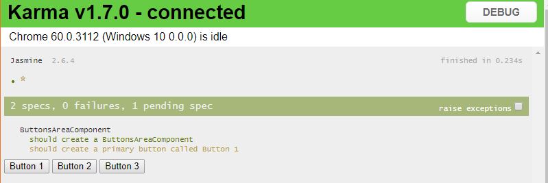
The buttons don’t look quite like we expected them to look.

To fix that we need to open the karma.config.js file. If you’re using the CLI, that file resides in your project’s root directory

Open it, find the call to config.set(), scroll down to the end of it and add a files array like this:

files: [
    './node_modules/bootstrap/dist/css/bootstrap.min.css'
]

The path may be different of course if you’re not including bootstrap via npm (although I strongly recommend it) or if you’re using another CSS framework.

So you end up with a karma.config.js like this:

// Karma configuration file, see link for more information
// https://karma-runner.github.io/0.13/config/configuration-file.html

module.exports = function (config) {
  config.set({
    basePath: '',
    frameworks: ['jasmine', '@angular/cli'],
    plugins: [
      require('karma-jasmine'),
      require('karma-chrome-launcher'),
      require('karma-jasmine-html-reporter'),
      require('karma-coverage-istanbul-reporter'),
      require('@angular/cli/plugins/karma')
    ],
    client:{
      clearContext: false // leave Jasmine Spec Runner output visible in browser
    },
    coverageIstanbulReporter: {
      reports: [ 'html', 'lcovonly' ],
      fixWebpackSourcePaths: true
    },
    angularCli: {
      environment: 'dev'
    },
    reporters: ['progress', 'kjhtml'],
    port: 9876,
    colors: true,
    logLevel: config.LOG_INFO,
    autoWatch: true,
    browsers: ['Chrome'],
    singleRun: false,
    files: [
      './node_modules/bootstrap/dist/css/bootstrap.min.css'
    ]
  });
};

Again this is with the default setup configured by the CLI. Now if we re-run the tests

karma-after

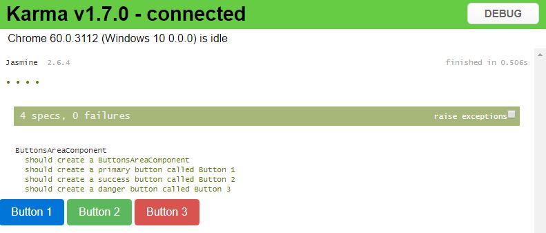
That’s it. It was pretty easy. Keep coding 😉

Flexible tabs in Vue.js [Part 2]

In the first part of this tutorial I showed you how easy it is to create a tabbed menu that changes dynamically using Vue.js.

We created the tab data, we implemented the tab swapping functionality and it’s now time to see how to add new tabs, edit the name of the tabs we have added and removing tabs.

Add New Tab
Let’s start by adding a new tab.

As you can see, nothing really happens when we click on the button that’s supposed to add a new tab. Let’s change that.

We’ll begin by adding a new method in the methods object. We’ll call it addNewTab.


addNewTab: function() {
    let newId = this.tabs[this.tabs.length - 1].id + 1;
    this.tabs.push({
        id: newId,
        title: `Tab ${newId}`,
        content: {
            header: 'New Tab Header',
            content: 'New tab contents'
        },
        editMode: false
    });
    this.activateTab(this.tabs[this.tabs.length - 1]);
},

The addNewTab method is responsible for finding the id of the new tab. It does that by incrementing the id of the last tab in the array. Next the only thing we have to add is push a new tab object in the tabs array. We don’t need to perform any other action to update the view. The Vue.js engine will pick up the change and will automatically add a new tab for us. The call to activateTab will also cause navigation to the new tab. Remember that an important principle of UI/UX design is that your application should feel natural to the user and the actions the user has to take must be similar to actions in other applications. So when users use a browser, they know that when they’re opening a new empty tab they will directed to it. That’s what we have to do to in our application too in order to take advantage of the user’s memory.

We need one more step to make this work. We need to call the method when the user clicks on the add button


<button class="icon-btn" v-on:click="addNewTab()">
    <i class="fa fa-plus" aria-hidden="true"></i>
</button>

Edit / Rename Tab

Now when organizing your data in tabs you may need to rename them to something more meaningful. Especially if we’re talking about a new tab. There are a few ways in which we can trigger the renaming process. We could put one more icon next to the x icon. Like a pencil icon or something like that. A font awesome icon will serve this purpose.

 <li v-for="tab of tabs" class="nav-item">
    <a v-bind:class="{'nav-link d-flex align-items-center tab': true, 'active': (tab.id == activeTab.id) }" href="#" v-on:click="activateTab(tab)">
        <span class="mr-5" v-show="!tab.editMode">{{tab.title}}</span>
        <input class="form-control" type="text" v-show="tab.editMode" placeholder="Tab Name" v-model="tab.title">
        <button class="icon-btn">
            <i class="fa fa-pencil" aria-hidden="true"></i>
        </button>
        <button class="icon-btn">
            <i class="fa fa-times" aria-hidden="true"></i>
        </button>
    </a>
</li>

I’ve also added some margin to separate the tab’s title from the buttons and changed the CSS that styled the x button to also target the pencil:

.fa {
    opacity: 0.54;
    transition: color $color-transition-duration;
    
    &:hover {
        color: $x-hover-color;
    }
}  

(The target class used to be .fa-times)

We will also need a text box that will only be visible when our tab is in edit mode. So let’s create a text input right under the tab’s title that will only be visible when the ‘editMode’ property of the tab object exists and is set to true.

<input class="form-control" type="text" v-show="tab.editMode" placeholder="Tab Name" v-model="tab.title">

Now we have to add one more property to our tab objects, the editMode property that will be set to false by default:

this.tabs.push({
    id: newId,
    title: `Tab ${newId}`,
    content: {
        header: 'New Tab Header',
        content: 'New tab contents'
    },
    editMode: false
});

After adding the editMode property we will need a way to set it to true. So we can add a method called ‘editTabName’ to our view model. That method will accept a tab object as an argument and it will set its editMode property to true. That way, the text box will appear every time we click on the pencil button

editTabName: function(tab){
    tab.editMode = true;
}

And of course we need to call the method from our view on the ‘click’ event:

<button class="icon-btn" v-on:click="editTabName(tab)">
    <i class="fa fa-pencil" aria-hidden="true"></i>
</button>

The ‘editTabName’ method turns the edit mode on:

editTabName: function(tab){
    tab.editMode = true;
}

And we also need way to turn it off. That’s why we need an extra button that will replace the pencil when editMode is active:

<button class="icon-btn" v-show="!tab.editMode" v-on:click="editTabName(tab)">
    <i class="fa fa-pencil" aria-hidden="true"></i>
</button>
<button class="icon-btn" v-show="tab.editMode" v-on:click="acceptEdit(tab)">
    <i class="fa fa-check" aria-hidden="true"></i>
</button>

The ‘acceptEdit’ method will just turn the edit mode off. Everything else is taken care of by Vue. We do not need to get the text from the textbox since we’ve used model binding:

acceptEdit: function(tab) {
tab.editMode = false;
}

Deleting a tab

The deletion process is pretty simple. We ‘re just filtering out the deleted tab:

deleteTab: function(tab) {
    this.tabs = this.tabs.filter(t => t.id != tab.id);
}

Of course you have to make sure that you call the method when the delete button is clicked passing it the tab to delete.

Aaaand we have a fully functional tabbed menu with Vue.js. The code is open to modification that can make it adapt to your needs and it’s a nice place to start.

The complete JSFiddle: