How to properly center CSS pseudo elements

Pseudo elements are great when you want to add that something that will make your page or app shine. There times though when you want to center those before or after pseudo elements and using percentages doesn’t do it. Going with the plain old margin: auto trick or using flexbox doesn’t quite work either. In this quick post I’m going to explain how you can perfectly style your pseudo element and be sure that it will work no matter the resolution or font-size or whatever.

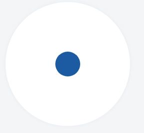
Let’s say that we want to create a button like this one below. It kind of looks like an eye.

eye1

Obviously we need to first design the outer circle. Let’s make something big and go for 250 pixels:

width: 250px;
height: 250px;

We want it round so let’s also add 100% border radius:

border-radius: 100%;

White background:

background-color: white;

We will be absolutely positioning a pseudo element later so we need the container element to be positioned relatively:

position: relative;

A subtle border:

border-style: solid;
border-width: 1px;
border-color: #e8eef6;

When it comes to borders I generally try to avoid the shorthand notation because to me it seems easier to comprehend when the properties span different lines.

Also, a subtle box shadow created shamelessly using the Chrome Dev Tools:

box-shadow: 0 0 6px 1px #e8eef6;

And let’s add some typical margin:

margin: 12px;

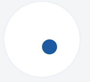
So with those rules in place you will be getting something like this:

eye2

We’re done with the easy part, we’ve successfully designed the outer circle. Now to the inner one.

Let’s set the size of the inner circle to 50 pixels and use a variation of blue for its background color:

 content: "";
 position: absolute;
 width: 50px;
 height: 50px;
 background-color: #1c5ba2;
 border-radius: 100%; 

Now before doing anything else, if we check the result we have this monstrosity:

eye4

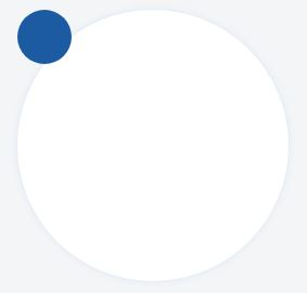
The inner circle naturally resides on the upper left corner of the container element. We need to move it so let’s use the top and left properties:

left: 50%;
top: 50%;

eye5

Well.. It’s actually better than before but we’re nowhere near our desired end result. But why is this happening you might ask? We used percentages right? 50% from the top and 50% percent from the left should be enough to place this pseudo element right at the center of its container. Well this may sound reasonable but it isn’t if you know the internal details of how CSS works. You see, this would work fine if top: 50% meant “Place the center of the pseudo element 50% from the top” and left 50% meant “Place the center of the pseudo element 50% from the left”.

But what top: 50% actually means is: “Place the pseudo element’s 50% from the top” and left: 50% means “Place the pseudo-element’s left-most point 50% from the left”. That’s how CSS works. That’s why the inner circle was placed on the upper left corner of the container element before we moved it. Elements are placed from left to right and from top to bottom.

The solution to this will be to move the center of the inner circle to the center of the outer circle. We can do that by using negative margins. We’ve defined the pseudo-element’s size (width = height since this is a round element) equal to 50pixels. That means the element’s center, the circle’s center is 50/2 =25px from the left and 50/2 = 25 25 pixels from the top. We can add those numbers as negative margins:

margin-top: -25px;
margin-left: -25px;

And poof! Problem solved!

eye1

Bonus: If you’re using a CSS pre-compiler like Sass you can take it one step further and only have one single number that describes your shape. The outer circle’s size. Everything else can be computed using mathematical operations. Check the following fiddle for more on this:

Flexible tabs in Vue.js [Part 2]

In the first part of this tutorial I showed you how easy it is to create a tabbed menu that changes dynamically using Vue.js.

We created the tab data, we implemented the tab swapping functionality and it’s now time to see how to add new tabs, edit the name of the tabs we have added and removing tabs.

Add New Tab
Let’s start by adding a new tab.

As you can see, nothing really happens when we click on the button that’s supposed to add a new tab. Let’s change that.

We’ll begin by adding a new method in the methods object. We’ll call it addNewTab.


addNewTab: function() {
    let newId = this.tabs[this.tabs.length - 1].id + 1;
    this.tabs.push({
        id: newId,
        title: `Tab ${newId}`,
        content: {
            header: 'New Tab Header',
            content: 'New tab contents'
        },
        editMode: false
    });
    this.activateTab(this.tabs[this.tabs.length - 1]);
},

The addNewTab method is responsible for finding the id of the new tab. It does that by incrementing the id of the last tab in the array. Next the only thing we have to add is push a new tab object in the tabs array. We don’t need to perform any other action to update the view. The Vue.js engine will pick up the change and will automatically add a new tab for us. The call to activateTab will also cause navigation to the new tab. Remember that an important principle of UI/UX design is that your application should feel natural to the user and the actions the user has to take must be similar to actions in other applications. So when users use a browser, they know that when they’re opening a new empty tab they will directed to it. That’s what we have to do to in our application too in order to take advantage of the user’s memory.

We need one more step to make this work. We need to call the method when the user clicks on the add button


<button class="icon-btn" v-on:click="addNewTab()">
    <i class="fa fa-plus" aria-hidden="true"></i>
</button>

Edit / Rename Tab

Now when organizing your data in tabs you may need to rename them to something more meaningful. Especially if we’re talking about a new tab. There are a few ways in which we can trigger the renaming process. We could put one more icon next to the x icon. Like a pencil icon or something like that. A font awesome icon will serve this purpose.

 <li v-for="tab of tabs" class="nav-item">
    <a v-bind:class="{'nav-link d-flex align-items-center tab': true, 'active': (tab.id == activeTab.id) }" href="#" v-on:click="activateTab(tab)">
        <span class="mr-5" v-show="!tab.editMode">{{tab.title}}</span>
        <input class="form-control" type="text" v-show="tab.editMode" placeholder="Tab Name" v-model="tab.title">
        <button class="icon-btn">
            <i class="fa fa-pencil" aria-hidden="true"></i>
        </button>
        <button class="icon-btn">
            <i class="fa fa-times" aria-hidden="true"></i>
        </button>
    </a>
</li>

I’ve also added some margin to separate the tab’s title from the buttons and changed the CSS that styled the x button to also target the pencil:

.fa {
    opacity: 0.54;
    transition: color $color-transition-duration;
    
    &:hover {
        color: $x-hover-color;
    }
}  

(The target class used to be .fa-times)

We will also need a text box that will only be visible when our tab is in edit mode. So let’s create a text input right under the tab’s title that will only be visible when the ‘editMode’ property of the tab object exists and is set to true.

<input class="form-control" type="text" v-show="tab.editMode" placeholder="Tab Name" v-model="tab.title">

Now we have to add one more property to our tab objects, the editMode property that will be set to false by default:

this.tabs.push({
    id: newId,
    title: `Tab ${newId}`,
    content: {
        header: 'New Tab Header',
        content: 'New tab contents'
    },
    editMode: false
});

After adding the editMode property we will need a way to set it to true. So we can add a method called ‘editTabName’ to our view model. That method will accept a tab object as an argument and it will set its editMode property to true. That way, the text box will appear every time we click on the pencil button

editTabName: function(tab){
    tab.editMode = true;
}

And of course we need to call the method from our view on the ‘click’ event:

<button class="icon-btn" v-on:click="editTabName(tab)">
    <i class="fa fa-pencil" aria-hidden="true"></i>
</button>

The ‘editTabName’ method turns the edit mode on:

editTabName: function(tab){
    tab.editMode = true;
}

And we also need way to turn it off. That’s why we need an extra button that will replace the pencil when editMode is active:

<button class="icon-btn" v-show="!tab.editMode" v-on:click="editTabName(tab)">
    <i class="fa fa-pencil" aria-hidden="true"></i>
</button>
<button class="icon-btn" v-show="tab.editMode" v-on:click="acceptEdit(tab)">
    <i class="fa fa-check" aria-hidden="true"></i>
</button>

The ‘acceptEdit’ method will just turn the edit mode off. Everything else is taken care of by Vue. We do not need to get the text from the textbox since we’ve used model binding:

acceptEdit: function(tab) {
tab.editMode = false;
}

Deleting a tab

The deletion process is pretty simple. We ‘re just filtering out the deleted tab:

deleteTab: function(tab) {
    this.tabs = this.tabs.filter(t => t.id != tab.id);
}

Of course you have to make sure that you call the method when the delete button is clicked passing it the tab to delete.

Aaaand we have a fully functional tabbed menu with Vue.js. The code is open to modification that can make it adapt to your needs and it’s a nice place to start.

The complete JSFiddle:

How to trigger a CSS animation on button click

In this tutorial we are going to see how to create a CSS animation and trigger it every time we click on a button. We’re going to use pure JavaScript. We’re not going to use jQuery because it’s not really needed and as we’ve seen in a previous blog post jQuery makes our scripts slower so avoiding it whenever possible will transform our code to be more efficient even if it may take a few more lines to achieve the same thing.

This example’s use case is a pretty common one, you have some data displayed to the user via a grid, a chart or simply an unordered list and that data may change overtime so you want to give the user the change to reload the data again from the server asynchronously. Usually for that kind of task you will need to employ a user-friendly icon button and not just throw a “Refresh” button. Something like this:

refresh

looks way more slick and increases the UX points of your site. The reason for this is that the user prefers to scan the page instead of reading it so removing unwanted text from action buttons and filters actually makes the browsing experience faster and more pleasant. Adding to that, users find it easier to use an interface that seems familiar to them. A refresh button like the one above is something that the user sees and utilizes in a regular basis in other applications like the operating system (especially mobile OSes) and the browser itself.

Enough talking, let’s get to the code. We’re obviously going to need a button and a refresh icon. We get the icon from FontAwesome (https://fontawesome.io/icons/) and style (using Sass of course) the button a bit to remove borders, make its background-color transparent, put a nice color to the refresh button and change the cursor to the “hand pointer” when the user hovers over the button.

Ignore the animation stuff for now and focus on the icon-btn class used to render the button. We’ll get to the animation mixins shortly

When it comes to animations that need to support a variety of browser versions we tend to get lost in the chaos of vendor specific prefixed but Sass, as always, comes to the rescue. To create the animation we use the @keyframes keyword and state that we want our animation to rotate the icon 360 degrees.The @-webkit- prefix is used to ensure Safari 4.0-8.0 compatibility.

Then we need a class that will apply the animation to the icon, let’s name it ‘spin-animation’. Every time we apply this class to the icon the icon will spin. We need to provide 3 details to the browser’s animation engine:
– The animation name, spin
– The animation duration, say, 0.5 seconds,
– The animation timing function. For this example we set it to ‘ease-in’ so our animation starts slowly and then builds up speed fast.

To include all possible vendor prefixed we create a mixin for each of these properties, animation-name mixin, animation-duration mixin and animation-timing-function mixin. We also create one fourth mixin that takes three parameters, the animation name, the animation duration and the animation-timing-function and passes them to the other three mixins. That way our code becomes extremely clean because we only need to include one mixin to our .spin-animation class in order for it to work as expected.

Now to the JavaScript part. Check the updated fiddle below that also presents the JavaScript code:


Every time the user clicks on the button, the icon should spin. To do that we listen for the button’s ‘click’ event and add the ‘spin-animation’ class to the icon. If we were to stop at this point, and not include the call to setTimeout, the code would actually work. The icon would spin on button click. But it would spin only once. The next click wouldn’t cause the button to spin. You can simulate this behavior by commenting out the call to setTimeout in the above fiddle. The reason why the second (and the third, and the fourth…) click fails is because the class is already set and the animation iteration count is by default set to 1 (Setting it to infinite would cause the button to spin eternally). So what do we do? We remove it after the animation is complete!. setTimeout ensures that upon animation completion after 500ms, which can be translated to 0.5s which is the animation-duration, the spin-animation class will be removed from the icon thus allowing the button to spin when the class is added again in the future.

That’s how you can work with animations that need to run for a finite number of iterations when triggered by some DOM event. That’s all for today! Bye!

jQuery vs getElementById vs querySelector

Last time we talked about performance in JavaScript and how that can be measured. To better illustrate the usage of the performance.now function and how it can be used to help us decide which method we should use to accomplish a certain task in our code, this time we will test the 3 most common methods of selecting a specific DOM element:
• jQuery’s $() selector is probably the most common and the first one that comes to mind
• document.getElementById is the classic method and perhaps the function that most JS developers are taught first
• document.querySelector is a relatively recent addition to the DOM API that’s supported by the latest browser versions out there

Test Case
Obviously the selection of one single DOM element is very rapid so it’s not the best of ways to test for the efficiency of those 3 methods. We’re talking about an operation that takes nanoseconds (or even less..) to finish. So even if we had the means to get test data about such a small timeframe it still wouldn’t be a fair comparison since there countless of factors affecting the final result, like different browser threads or even different processes running on the system. To get a better understanding we need to enlarge our test pool. For that, in the following example we will use a for loop to spawn 10 thousand buttons, append them to the DOM tree and them we will use the 3 methods mentioned above to select all the buttons, one button at a time using for loops. So we want to end up to something like the following pseudocode:

var t0 = performance.now();
for(1 to 10000){
	//select using jquery
}
var t1 = performance.now();

var t0 = performance.now();
for(1 to 10000){
	//select with document.getElementById
}
var t1 = performance.now();

var t0 = performance.now();
for(1 to 10000){
	//select with document.querySelector
}
var t1 = performance.now();

After the tests are done, hopefully we’re going to have a clear answer as to which one of these methods we should use to speed up our script’s execution.

The Button Spawnner

The following is a simple algorithm used for spawning a button with id ‘id’, inside ‘container’ with text content ‘contents’:

We want to spawn quite a lot of buttons so let’s just start by placing a constant at the top of our script and set the number of buttons that we want to create. That way, if 10 thousand isn’t enough for us to reach a verdict we can return and change the number of buttons from a single point in our code:

const BTN_NUM = 10000;

We will also need a container div to host the remarkable amount of buttons we’re about to create:


<div id="mydiv">    
    
</div>

We select the div element using getElementById (or maybe we should use jQuery, it might be faster, or querySelector, anyway we’ll see in a moment 😛 )

let myDiv = document.getElementById('mydiv');

We also need to introduce a naming scheme for the 10k buttons so that we don’t have a hard time selecting them from the inside of a loop. It doesn’t have to be something complex. “btn-i” where ‘i’ is the incremented value will do just fine. So let’s spawn the buttons!!

let idPrefix = "btn-";
for(let i=0; i<BTN_NUM; i++){
	let name = idPrefix + i;
	spawnButton(name, myDiv, "Button");
}

If you run the script at this point, your browser window will fill with buttons capable of causing a seizure to people with light sensitivity but bear with me a little while longer and we’ll soon know which is the fastest method.

Let’s declare some required variables for our tests:

let t0, t1, jQueryPerformance, getElementPerformance, querySelectorPerformance;

And start them finally:

Running the tests I got these results (I ran each test three times to get a more definitive answer):

Google Chrome

chrome

Mozilla Firefox

firefox

Microsoft Edge


edge