Maintain Intellisense in Express Handler Wrappers

Wrapping ExpressJS handler functions is a common practice. I especially like express handlers for catching errors in async functions and redirecting them to global Express error handling middleware.

The following is an example of such a handler:

When the passed async Request Handler fails with an exception or Promise rejection, the error will be passed to the next function and it will be sent to the first error handler in the middleware pipeline.

We can use it in our Express application like this:

This allows for centralized error handling and simple clean code with out intrusive try/catch blocks. But that’s a matter for another discussion.

The issue we face when wrapping Express request handlers is that we miss important typings for the two primary arguments, The Request and Response objects. Now unless you are still writing code in your green-text-in-black-background nano editor running on your custom build of Kali you probably take advantage of some form of auto-complete. Visual Studio Code for example offers Intellisense. Intellisense if the practice of the editor providing information for object members and function signatures to you dynamically while writing code.
Here’s a screenshot of Visual Studio code showing a list of members that can be found in the response object:

Intellisense was made with typed languages in mind so what can we do in JavaScript? (“Write TypeScript is a completely valid answer to this question and I endorse it”). Well in JavaScript, we need to work a bit more to maintain Intellisense and since we can’t just state that req is a request object and res is a response object when declaring the callback inside the wrapper we have to use code metadata and VSCode will understand.

With some simple modification in the wrapper module we can maintain Intellisense and save ourselves the headache.
First, we have to dig into Express typings. Typings are d.ts files that provide metadata for JavaScript modules. Not all libraries have them, but at least Express does. You can view Express’ typings by ctrl-clicking on a require statement that points to express:

Searching the file we can find the following:

Notice that we have to use ES6 module syntax when importing RequestHandler.

We need one last change to make this work. We need to open the async-wrapper.js file and convert our module to a named one:

Notice that we have to use ES6 module syntax when importing RequestHandler.

We need one last change to make this work. We need to open the async-wrapper.js file and convert our module to a named one:

Now if we check a file where we use AsyncWrapper, we can see that Intellisense is back.

No, async/await won’t save you from Promises

One of the most remarkable announcements of the previous year was the adoption of ES7 features by NodeJS. The release of NodeJS version 7.6.0 was followed by tremendous applause by the JavaScript community that fueled a development frenzy. JavaScript developers were convinced that not only was the callback hell gone for good, but also so were promises. And it wasn’t just backend developers that were impressed. Frontend developers working on the hottest JS framework of the week were also impressed and refactoring all of their services and asynchronous calls to go with the hype. You could suddenly hear devs whispering during meetups about this amazing new feature of async/await like if it is the holy grail of innovation (hint, C# has been supporting this feature for years).

The reason why JavaScript developers loved async/await was primarily because of the given ability to write streamlined code without having to worry about callbacks and different orders of execution. It was like ES7 lifted the responsibility of writing optimized asynchronous code off of their shoulders. Everything seems simpler if you don’t have to use callbacks and yes the function you pass to .then() is still a callback. It’s pretty obvious to every sane person out there that going from this:

To this:

Is an improvement. And certainly this:

is probably as good as it can get.

So why still bother using promises? If you were tutoring a new JavaScript developer you might as well tell them to discard promises and learn to use async/await everywhere, right? WRONG!

Promises are still useful and let’s not forget that async/await does make use of promises under the hood. Did you know that you can attach a then call at the end of an async function you will be able to run a callback after the async function terminates? Also, did you know that if you omit the ‘await’ keyword you get back a promise? So yeah, promises are here to stay and there’s one particular use case where promises can still shine.

Suppose you have a few arbitrary sensors returning some temperatures, min, max, average, that short of thing. Let’s simulate the asynchronous nature of a system like that by using setTimeout:

So, now you have 3 functions taking a few seconds to return the sensor data. The first one takes 2000ms, the second one takes 1000ms and the third one takes 3000ms.

What if we needed to have a function that takes all sensor data and performs a computation based on a formula. We would have to wait for all 3 sensors to finish. Since all 3 functions use promises and we already know the connection between promises and async/await let’s do this using the latest ES7 feature:

Using the performance interface I measured the execution time of the above function to ~6000ms (6006ms to be precise). I don’t know about you but that seems like a lot of time to me and it definitely does not feel like it’s asynchronous at all. Sure we can do better.

The following code makes use of the invaluable Promise.all function:

Promise.all takes an array of promises and returns a single promise that gets resolved when all other promises get resolved. If we use the performance.now() method one more time we can see that the execution time goes down to 3001ms. To compare the two functions you can use this fiddle (only run the fiddle in browsers that do support async/await):

If we change the third timeout’s delay from 3000ms to 4000ms and run the example the above code we see that it takes ~7000ms with async/await and ~4000ms with Promise.all, both reasonable values considering that we increased the delay by 1000ms.

It’s pretty evident that Promise.all is a better method for waiting for multiple promises to resolve but why? Well the reason stands in the order in which the async/await function calls the 3 sensor functions.

This is how the functions get called:

The getSensorAData function is called at the beginning and the getSensorBData function is not called until after getSensorAData has returned. And the same happens with getSensorCData. So we end up with a total time that is the sum of the functions’ execution times plus a few milliseconds because of the call to console.log and CPU time.

In the Promise.all approach however, all 3 functions are executed almost at the same time (not exactly the same time, remember JavaScript is single-threaded). So we end up with the following timeline:

That’s why this approach’s execution time almost matches the execution time of the function that takes the longest time to complete. A little side-note here, what you see in the image above is not multi-threading. JavaScript does not support that kind of thing. The image depicts the time it takes for each function to finish relative to its starting time. That does not mean that getSensorA, for example, occupies the browser thread for 2 seconds straight.

The improvement in execution time we achieved by using Promise.all is no small feat. In larger applications the improvement could be massive and until we are able to await multiple async functions at the same time and that feature is supported by the latest version of NodeJS and at least one transpiler, the Promise.all will be the perfect solution and the promise-based syntax will still be alive.

Anagram check in a JavaScript interview?

I was recently at a job interview for a position related to Angular and C# development. After a few questions about design patterns and CSS I was finally asked to code something. I was never one to dislike technical interviews, even the whiteboard ones. Because I know that interviewers value the thought process more than the actual result. I know. I’ve been there.

But what surprised me was that the task at hand had nothing to do with Angular or C#. Instead it was a traditional interview question regarding anagrams.

So the interviewer asked me to code a function that would check if two strings are anagrams of each other.

The strategy when faced with a task like that is to first ask your interviewer some questions that you may have regarding the problem. If you don’t have any questions it’s always nice to repeat the problem back to your interviewer. Remember, they’re not just after your impressive coding skills, they want to see you’re equally able to communicate, an area in which quite a lot of developers are inferior.

After showing that you can communicate effectively, it’s time to analyze the problem. Again it’s imperative that you think out loud. If you sit silent staring at the keyboard, or the white board depending on your situation, two things will happen. First, you may be synthesizing the most architecturally and algorithmically perfect solution based on your impeccable skills and incomparable experience, but the interviewer might as well think that you’ve frozen. So, again, communicate. The second thing that’s gonna happen is that if you haven’t figured out the solution, anxiety will eventually cripple you. By talking you get your brain to start thinking. You can’t go from “completely frozen” to “devising the perfect algorithm” just like you can’t get your car from stationery to running at 200km/h in a second’s time.

Don’t attempt to arrive to the optimal solution on first try. Start by finding something that works. In the case of the anagram problem, the first possible solution that I mentioned was to create a “dictionary” for storing each letter in each word along with the number of times that the letter appears within the word. So of we have the strings “baba” and “abba” the we would have two equivalent objects like this:

Literally five seconds after recommending that solution to the interviewer, an actual better solution came to my mind. I would sort the two strings and then compare them. If they’re equal then we have an anagram.

The final touch that I added was an initial check of the strings’ lengths. If the strings don’t have equal lengths then we can immediately return false because we can be absolutely certain that the strings are not anagrams of each other.

The final algorithm after optimizations looks like this:

A fairly simplistic approach with chained calls to split, sort and join to enhance readability.

That’s it for today. I hope you found this answer to a common interview question helpful. See you next time.

How to add Bootstrap to Karma in Angular 4

Karma is a wonderful JavaScript test runner that starts a browser and displays everything you need to know about your test suite. Successful tests, Failed tests, pending tests. Everything. But what makes it really powerful is its ability to also display the component you’re testing each time. It’s also the default task runner for Angular CLI projects.

The thing is though, that the default Angular project created by the CLI does not include any CSS frameworks you may be using, like Bootstrap for example. Custom component styles are included if you’ve added them to the styleUrls array in your component decorator like this

@Component({
    selector: 'app-buttons-area',
    templateUrl: './buttons-area.component.html',
    styleUrls: ['./buttons-area.component.css']
})

In this example we have an app-buttons-area component that comes with some custom styles written exclusively in buttons-area.component.css

But most of the time your custom styles are complementary to more global styling either in the form of a CSS Framework like Bootstrap or Foundation, or in a global styles.css file that you may compile from Sass sources. Karma does not include those styles when producing the end result.

The good news is that it’s very easy to include them yourself. In this example we’re going to add Bootstrap’s css that we have installed using npm but you can do the same with your custom styles.

In the buttons-area.component.html we have three buttons styled exclusively using Bootstrap 4 classes:

<div class="row">
    <div class="col">
        <button class="btn btn-primary" (click)="btn1Clicked()">Button 1</button>
        <button class="btn btn-success" (click)="btn2Clicked()">Button 2</button>
        <button class="btn btn-danger" (click)="btn3Clicked()">Button 3</button>
    </div>
</div>
<div class="row">
    <div class="col">
        <span>{{output}}</span>
    </div>
</div>

But if we run the test using ng test we get this:

karma-before

The buttons don’t look quite like we expected them to look.

To fix that we need to open the karma.config.js file. If you’re using the CLI, that file resides in your project’s root directory

Open it, find the call to config.set(), scroll down to the end of it and add a files array like this:

files: [
    './node_modules/bootstrap/dist/css/bootstrap.min.css'
]

The path may be different of course if you’re not including bootstrap via npm (although I strongly recommend it) or if you’re using another CSS framework.

So you end up with a karma.config.js like this:

// Karma configuration file, see link for more information
// https://karma-runner.github.io/0.13/config/configuration-file.html

module.exports = function (config) {
  config.set({
    basePath: '',
    frameworks: ['jasmine', '@angular/cli'],
    plugins: [
      require('karma-jasmine'),
      require('karma-chrome-launcher'),
      require('karma-jasmine-html-reporter'),
      require('karma-coverage-istanbul-reporter'),
      require('@angular/cli/plugins/karma')
    ],
    client:{
      clearContext: false // leave Jasmine Spec Runner output visible in browser
    },
    coverageIstanbulReporter: {
      reports: [ 'html', 'lcovonly' ],
      fixWebpackSourcePaths: true
    },
    angularCli: {
      environment: 'dev'
    },
    reporters: ['progress', 'kjhtml'],
    port: 9876,
    colors: true,
    logLevel: config.LOG_INFO,
    autoWatch: true,
    browsers: ['Chrome'],
    singleRun: false,
    files: [
      './node_modules/bootstrap/dist/css/bootstrap.min.css'
    ]
  });
};

Again this is with the default setup configured by the CLI. Now if we re-run the tests

karma-after

That’s it. It was pretty easy. Keep coding 😉

Flexible tabs in Vue.js [Part 2]

In the first part of this tutorial I showed you how easy it is to create a tabbed menu that changes dynamically using Vue.js.

We created the tab data, we implemented the tab swapping functionality and it’s now time to see how to add new tabs, edit the name of the tabs we have added and removing tabs.

Add New Tab
Let’s start by adding a new tab.

As you can see, nothing really happens when we click on the button that’s supposed to add a new tab. Let’s change that.

We’ll begin by adding a new method in the methods object. We’ll call it addNewTab.


addNewTab: function() {
    let newId = this.tabs[this.tabs.length - 1].id + 1;
    this.tabs.push({
        id: newId,
        title: `Tab ${newId}`,
        content: {
            header: 'New Tab Header',
            content: 'New tab contents'
        },
        editMode: false
    });
    this.activateTab(this.tabs[this.tabs.length - 1]);
},

The addNewTab method is responsible for finding the id of the new tab. It does that by incrementing the id of the last tab in the array. Next the only thing we have to add is push a new tab object in the tabs array. We don’t need to perform any other action to update the view. The Vue.js engine will pick up the change and will automatically add a new tab for us. The call to activateTab will also cause navigation to the new tab. Remember that an important principle of UI/UX design is that your application should feel natural to the user and the actions the user has to take must be similar to actions in other applications. So when users use a browser, they know that when they’re opening a new empty tab they will directed to it. That’s what we have to do to in our application too in order to take advantage of the user’s memory.

We need one more step to make this work. We need to call the method when the user clicks on the add button


<button class="icon-btn" v-on:click="addNewTab()">
    <i class="fa fa-plus" aria-hidden="true"></i>
</button>

Edit / Rename Tab

Now when organizing your data in tabs you may need to rename them to something more meaningful. Especially if we’re talking about a new tab. There are a few ways in which we can trigger the renaming process. We could put one more icon next to the x icon. Like a pencil icon or something like that. A font awesome icon will serve this purpose.

 <li v-for="tab of tabs" class="nav-item">
    <a v-bind:class="{'nav-link d-flex align-items-center tab': true, 'active': (tab.id == activeTab.id) }" href="#" v-on:click="activateTab(tab)">
        <span class="mr-5" v-show="!tab.editMode">{{tab.title}}</span>
        <input class="form-control" type="text" v-show="tab.editMode" placeholder="Tab Name" v-model="tab.title">
        <button class="icon-btn">
            <i class="fa fa-pencil" aria-hidden="true"></i>
        </button>
        <button class="icon-btn">
            <i class="fa fa-times" aria-hidden="true"></i>
        </button>
    </a>
</li>

I’ve also added some margin to separate the tab’s title from the buttons and changed the CSS that styled the x button to also target the pencil:

.fa {
    opacity: 0.54;
    transition: color $color-transition-duration;
    
    &:hover {
        color: $x-hover-color;
    }
}  

(The target class used to be .fa-times)

We will also need a text box that will only be visible when our tab is in edit mode. So let’s create a text input right under the tab’s title that will only be visible when the ‘editMode’ property of the tab object exists and is set to true.

<input class="form-control" type="text" v-show="tab.editMode" placeholder="Tab Name" v-model="tab.title">

Now we have to add one more property to our tab objects, the editMode property that will be set to false by default:

this.tabs.push({
    id: newId,
    title: `Tab ${newId}`,
    content: {
        header: 'New Tab Header',
        content: 'New tab contents'
    },
    editMode: false
});

After adding the editMode property we will need a way to set it to true. So we can add a method called ‘editTabName’ to our view model. That method will accept a tab object as an argument and it will set its editMode property to true. That way, the text box will appear every time we click on the pencil button

editTabName: function(tab){
    tab.editMode = true;
}

And of course we need to call the method from our view on the ‘click’ event:

<button class="icon-btn" v-on:click="editTabName(tab)">
    <i class="fa fa-pencil" aria-hidden="true"></i>
</button>

The ‘editTabName’ method turns the edit mode on:

editTabName: function(tab){
    tab.editMode = true;
}

And we also need way to turn it off. That’s why we need an extra button that will replace the pencil when editMode is active:

<button class="icon-btn" v-show="!tab.editMode" v-on:click="editTabName(tab)">
    <i class="fa fa-pencil" aria-hidden="true"></i>
</button>
<button class="icon-btn" v-show="tab.editMode" v-on:click="acceptEdit(tab)">
    <i class="fa fa-check" aria-hidden="true"></i>
</button>

The ‘acceptEdit’ method will just turn the edit mode off. Everything else is taken care of by Vue. We do not need to get the text from the textbox since we’ve used model binding:

acceptEdit: function(tab) {
tab.editMode = false;
}

Deleting a tab

The deletion process is pretty simple. We ‘re just filtering out the deleted tab:

deleteTab: function(tab) {
    this.tabs = this.tabs.filter(t => t.id != tab.id);
}

Of course you have to make sure that you call the method when the delete button is clicked passing it the tab to delete.

Aaaand we have a fully functional tabbed menu with Vue.js. The code is open to modification that can make it adapt to your needs and it’s a nice place to start.

The complete JSFiddle:

Flexible tabs in VueJS [Part 1]

Hello everyone. In this post I’m going to show you how to create a tabbed navigation in VueJS. Tabs are a very flexible and easy way to switch between content. Users are very accustomed with them because, well, they use them already. In their browsers! Working with a tabbed layout is even easier with Vue.

To speed things up and reduce the time spent styling the tabs we are going to use Bootstrap 4. At the time of this writing, Bootstrap 4 is still in alpha version but it’s very stable and brings in some powerful new features. So I’ve ditched Bootstrap 3 in favor of its newer edition. After adding Bootstrap 4 let’s create 3 simple tabs using the ‘nav-tabs’ Bootstrap class:

<div class="container-fluid">
    <div class="row">
        <div class="col-12">
            <ul class="nav nav-tabs">
                <li class="nav-item">
                    <a class="nav-link active" href="#">Tab 1</a>
                </li>
                <li class="nav-item">
                    <a class="nav-link" href="#">Tab 2</a>
                </li>
                <li class="nav-item">
                    <a class="nav-link" href="#">Tab 3</a>
                </li>
            </ul>
        </div>
    </div>
</div>

You can see the result we get is very satisfying, taking into account the amount of code we had to write to produce this.

tabblog1

Now that we’ve created the tabs we need a way to fill in their contents. The best tool for this job is a Bootstrap card

So let’s place the following code snippet right under our tabs:

<div class="card tab-contents">
    <div class="card-block">
        <div class="card-title">
            Tab Contents here
        </div>
    </div>
</div>

The result is almost perfect:tabblog2

We need to remove this ugly line under the active tab so that our design can be a little bit more fluent and consistent.

.card.tab-contents {
    border-top: none;
}

Much better now:

tabblog3

Bootstrap gives us a stylistic starting point. But I think we have to improve our tabs to give them a more unique look and feel. To do that I changed some things in the HTML and I’ve added the following Sass styles and a font awesome icon on each tab that will serve as a ‘close button’. I’ve also made each tab a flex container, so that everything is aligned properly within it. A flex container will also be useful to us later when we will add a text box for renaming the tab

HTML:

<div class="container-fluid">
    <div class="row">
        <div class="col-12">
            <ul class="nav nav-tabs">
                <li class="nav-item">
                    <a class="nav-link d-flex align-items-center active tab" href="#">
                        <span>Tab 1</span>
                        <button class="icon-btn">
                            <i class="fa fa-times" aria-hidden="true"></i>
                        </button>
                    </a>
                </li>
                <li class="nav-item">
                    <a class="nav-link d-flex align-items-center tab" href="#">
                        <span>Tab 2</span>
                        <button class="icon-btn">
                            <i class="fa fa-times" aria-hidden="true"></i>    
                        </button>
                    </a>
                </li>
                <li class="nav-item">
                    <a class="nav-link d-flex align-items-center tab" href="#">
                        <span>Tab 3</span>
                        <button class="icon-btn">
                            <i class="fa fa-times" aria-hidden="true"></i>
                        </button>
                    </a>
                </li>
            </ul>
            <div class="card tab-contents">
                <div class="card-block">
                    <div class="card-title">
                        Tab Contents here
                    </div>
                </div>
            </div>
        </div>
    </div>
</div>

Sass:

$color-transition-duration: 0.8s;
$accent-color: #2980b9;
$x-hover-color: #c0392b;
$smaller-nav-item-padding: 8px;
$icon-size: 0.875rem;

ul.nav-tabs {
    margin-top: 12px;
}

.card.tab-contents {
    border-top: none;
    border-radius: 0;
} 

.nav-link.tab {
    border-radius: 0;
    
    //Override the 16px Bootstrap default to give it a more tab-like feel
    padding-right: $smaller-nav-item-padding;
    
    span {
        transition: color $color-transition-duration;    
        color: black;
        opacity: 0.54;
        &:hover {
            color: $accent-color;
        }
    }
    
    &.active {
        span {
            opacity: 1;
        }
    }
           
    .icon-btn {
        margin-left: 6px;
        text-decoration: none;    
        background-color: transparent;
        border: none;
        cursor: pointer;
        outline: none;
        font-size: $icon-size;

        .fa-times {
            opacity: 0.54;
            transition: color $color-transition-duration;
            
            &:hover {
                color: $x-hover-color;
            }
        }    
    }    
}

I’ve added some top margin, made the borders rectangular, grayed out the inactive tabs and added a nice transition. Nothing fancy, with enough room for further customization.

One last thing we are going to need is an additional button that will open up a new tab

<li class="nav-item">
    <a class="nav-link d-flex align-items-center tab add-btn" href="#">
        <button class="icon-btn">
            <i class="fa fa-plus" aria-hidden="true"></i>
        </button>
    </a>
</li>

And its styles:

.nav-link.tab {
	&.add-btn {
        padding-left: $smaller-nav-item-padding;        
        
        .icon-btn {
            color: $accent-color;
            margin: 0;    
        }
    }
}

Now that we’ve built the HTML/CSS part we need to move to the actual logic that will allow our tabs to work.

We will create a VueJS view model, add an array of objects where each objects represents a tab and we will dynamically load the tabs and their content on screen. We will also need an activeTab object to store the selected tab which by default will be the first one. All these requirements are expressed in the following view model:

JavaScript:

let app = new Vue({
	el: '#app',
    data: {
    	activeTab: null,
    	tabs: [
        	{
            	id: 1,
            	title: 'Tab 1',
                content: {
                	header: 'Tab 1 Header',
                    content: 'Tab 1 Content: Lorem ipsum dolor sit amet, consectetur adipiscing elit'
                }
            },
            {
            	id: 2,
            	title: 'Tab 2',
                content: {
                	header: 'Tab 2 Header',
                    content: 'Tab 2 Content: Praesent feugiat aliquam odio, at dictum nibh. Ut vitae quam nec nunc rhoncus sodales. In luctus venenatis auctor'
                }
            },
            {
            	id: 3,
            	title: 'Tab 3',
                content: {
                	header: 'Tab 3 Header',
                    content: 'Tab 3 Content:  Praesent consectetur luctus tortor vel feugiat. Vestibulum vitae tempor ipsum, quis pharetra augue. '
                }
            }
        ]
    },
    created: function() {
    	this.activeTab = this.tabs[0];
    }
})

Now that we can dynamically load our tabs, the view greatly simplifies:

HTML:

<div id="app" class="container-fluid" v-cloak>
    <div class="row">
        <div class="col-12">
            <ul class="nav nav-tabs">
                <li v-for="tab of tabs" class="nav-item">
                    <a v-bind:class="{'nav-link d-flex align-items-center tab': true, 'active': (tab.id == activeTab.id) }" href="#">
                        <span>{{tab.title}}</span>
                        <button class="icon-btn">
                            <i class="fa fa-times" aria-hidden="true"></i>
                        </button>
                    </a>
                </li>
                <li class="nav-item">
                    <a class="nav-link d-flex align-items-center tab add-btn" href="#">
                        <button class="icon-btn">
                            <i class="fa fa-plus" aria-hidden="true"></i>
                        </button>
                    </a>
                </li>
            </ul>
            <div class="card tab-contents">
                <div class="card-block">
                    <div class="card-title">
                        {{activeTab.content.header}}
                    </div>
                    <div class="card-text">
                        {{activeTab.content.content}}
                    </div>
                </div>
            </div>
        </div>
    </div>
</div>

As you can see we have a v-for loop that populates a template of an li with all the information about the tab. Check the created() method, which is a Vue lifecycle hook called immediately after the view model is initialized. There we make activeTab point, by default, to the first tab

Next, we want a way to cycle through tabs, select one and view its contents. So basically ,we need to change the activeTab whenever we click on a tab and Vue will take care of the rest. To do that we create an ‘activateTab’ in our methods object with just one line of code:

activateTab: function(tab) {
       this.activeTab = tab;
}

Now we only need to handle the event click in the view and pass the tab object to activateTab like this:

 v-on:click="activateTab(tab)"

So our list item template now looks like this:

<li v-for="tab of tabs" class="nav-item">
    <a v-bind:class="{'nav-link d-flex align-items-center tab': true, 'active': (tab.id == activeTab.id) }" href="#" v-on:click="activateTab(tab)">
        <span>{{tab.title}}</span>
        <button class="icon-btn">
            <i class="fa fa-times" aria-hidden="true"></i>
        </button>
    </a>
</li>

You can check the code from the first part of this tutorial in the following fiddle:

In the next part of this tutorial, I’m going to show you how to add, edit and delete tabs. Stay tuned!

How to use momentjs with Vue

Okay this is going to be a short one 🙂

Momentjs is, without a doubt, the best JavaScript library for handling date and time objects. The first time I tried to use it with Vue though I was greeted with the following message:

"Property or method "moment" is not defined on the instance but referenced during render. Make sure to declare reactive data properties in the data option"

The reason why I got this message was because I was using moment in the view, in my .html file within Vue’s {{}} delimiters. Let’s demonstrate this with a simple example.

In the fiddle above we have a simple Vue instance with a list of posts that will be displayed in a simple table for approval. Everything is simple. We use v-for loop to get each post and then display its data in the table columns. But the postedAt field is a date! We can’t trust JavaScript to convert our date to a string otherwise it will look awful with all the added stuff like time zones. Let’s say we want to just format the date using a DD-MM style, meaning that we only want to display the day and month. Nothing else. What comes to every developer’s mind is, of course, the moment library. So that’s what we do. We import moment using whatever tool we want, yarn, NPM, jspm, pure script tag with a CDN URL. Just about anything will do. Then assuming that what’s inside the curly brackets is JavaScript code, we attempt to run the example…. Aaaand we get the error mentioned above. You can actually see it in the console.

Why is this happening?

It’s all a matter of “this” binding. Notice that whenever you display something in your View that comes from the view-model you do not use the ‘this’ keyword like you do inside the view-model. That’s because the view is tied to the view-model and the use of ‘this’ is not needed. Imagine if you had to use ‘this’ in your HTML. That would be awful. The moment instance is not in our view-model. It’s in the global object, window in this case . “So let’s just go ahead and put a ‘window’ keyword in front of moment”, you might say. Not so fast. The window object is in the global scope too. So you’ll get the same error.

What can we do to remedy this?

We need to include a reference of the moment function in our view-model. The solution is actually pretty straightforward. Just add this line

moment: moment

either in the ‘data’ object or in the ‘methods’ object of your view-model. And that’s it. It’It’s going to work. What we essentially did was to delegate moment through our view-model. See the working example:

And there you have it! Momentjs up and running with Vue in no time.

Ridiculously simple form validation with Vue and VeeValidate

Today a friend of mine and fellow developer was asked during the technical part of a job interview to create a registration form along with both client-side and server-side validation having only a small time frame at his disposal and absolutely zero code. This event led me to write the post you are currently reading. This is a very common interview question for jobs regarding web development or Single Page Application development roles. I’ve been asked to write a form with validation in an interview too. In fact I have even asked candidates, from the other end of the table that time, to complete a registration form when tasked with coming up with an interview question for a role at a startup I used to work for.

Anyway, the point is that this is something that gets asked a lot and it’s good to be prepared. I’m going to leave server side validation for another blog post and concentrate on the client side of things. When the clock is ticking and the first traces of anxiety start to appear you need to be prepared. Ok, designing the form is not hard. You can grab your favorite framework like Bootstrap, Foundation, Material or whatever suits your taste.

The most time consuming part of the task is the validation process. So I sat down and tried to think of a validation library that produces the fastest results. I have used several JS validation libraries in the past like ValidateJS, Parsely and Aurelia Validation but, by far the most efficient and, in my opinion, the most architecturally correct is VeeValidate. VeeValidate is an open source Vue.js plugin. In case you’ve never heard about it, Vue.js is a reactive, progressive JavaScript framework that recently reached version 2. It’s being used and recommended a lot by the people at Laravel, so much that it can be mistaken as part of the framework itself.

It’s amazing how quickly you can get up to speed with VeeValidate. To begin with, there are, mainly, two ways you can get it in your project. The simplest one is to just include the script tag

<script src="https://cdn.jsdelivr.net/vee-validate/2.0.0-beta.25/vee-validate.min.js"></script>

You then have access to VeeValidate as a global object.

The other way to go is to install it with npm and import it as an ES6 module in your application. (Reminder: At the time of this writing, ES6/ES2015 modules are not globally supported by most browsers so you’re going to need a bundler like Webpack)

Whatever way you choose you then have to register the plugin with Vue. To do this add the following line:

Vue.plugin(VeeValidate);

UPDATE 09/2017
If you’re using the newest version of Vue you will have to include VeeValidate using Vue.use

Vue.use(VeeValidate);

All set. You can begin using it. (If you dig deeper into the documentation you will see that you can also pass in a config object but that’s not the purpose of this tutorial. We want results fast with minimal configuration and VeeValidate can provide them out of the box).

Now to the best part which is also the reason why I said before that VeeValidate is the most architecturally correct validation library I have used is that you can write your validation exclusively in the view. In your .html file. That reduces view model pollution and makes it more testable. That way you can quickly switch views if you want without having to clean your view-model. That’s not to say that you will never need to write code in your view model but for most cases, at least 90% percent of the validation code will reside in the view.

VeeValidate supports a variety of validation rules which you can apply in a way similar to Laravel’s validation for those of you familiar with it. The basics of working with rules are:

• Rules are placed in a v-validate custom html attribute inaide the input that needs validation
• Rules are separated with a pipe (‘|’) just like in Laravel
• The input that you want to validate must have a name attribute.
• You can access the error messages by using the “errors” variable in the view
• You can check if a specific field is valid by checking if errors.has(““)
• You can access the first error message for a specific input with errors.first(““)
• You can access all error messages for a field using errors.all(““)

That’s essentially what you need to know to work with VeeValidate. Let’s skip the introduction and look at the code. Let’s say that you want to validate a password field. You want a password to always be present, so your password field is “required”. You also want it to be at least 8 characters long but no more than 32 characters. You can achieve it like this:

<input name="password" type="password" placeholder="Choose your password" v-validate="required|min:8|max:32">

To show an error message when the validation fails:

<span v-if="errors.has('password')">{{errors.first('password')}}</span>

Now that you know what VeeValidate is and how it works let’s move on to the form creation. I’m going to be using Bootstrap 4. You can swap the CSS classes with your own:

So as you can see the view model remains as clean as possible. All the validation takes part in the view and that’s what makes the library so awesome. Now if you want to provide custom error messages you will need to write some JavaScript code too but it does not have to be inside the view model. For more information check the official documentation http://vee-validate.logaretm.com/rules.html#custom-messages

It took me 34 minutes to create this form from scratch. I could have gone so far as to trying to achieve the same result using the validation libraries I mentioned above but that would make the post enormous and hard to write as well as read so I guess you’ll have to take my word for it.

How to trigger a CSS animation on button click

In this tutorial we are going to see how to create a CSS animation and trigger it every time we click on a button. We’re going to use pure JavaScript. We’re not going to use jQuery because it’s not really needed and as we’ve seen in a previous blog post jQuery makes our scripts slower so avoiding it whenever possible will transform our code to be more efficient even if it may take a few more lines to achieve the same thing.

This example’s use case is a pretty common one, you have some data displayed to the user via a grid, a chart or simply an unordered list and that data may change overtime so you want to give the user the change to reload the data again from the server asynchronously. Usually for that kind of task you will need to employ a user-friendly icon button and not just throw a “Refresh” button. Something like this:

refresh

looks way more slick and increases the UX points of your site. The reason for this is that the user prefers to scan the page instead of reading it so removing unwanted text from action buttons and filters actually makes the browsing experience faster and more pleasant. Adding to that, users find it easier to use an interface that seems familiar to them. A refresh button like the one above is something that the user sees and utilizes in a regular basis in other applications like the operating system (especially mobile OSes) and the browser itself.

Enough talking, let’s get to the code. We’re obviously going to need a button and a refresh icon. We get the icon from FontAwesome (https://fontawesome.io/icons/) and style (using Sass of course) the button a bit to remove borders, make its background-color transparent, put a nice color to the refresh button and change the cursor to the “hand pointer” when the user hovers over the button.

Ignore the animation stuff for now and focus on the icon-btn class used to render the button. We’ll get to the animation mixins shortly

When it comes to animations that need to support a variety of browser versions we tend to get lost in the chaos of vendor specific prefixed but Sass, as always, comes to the rescue. To create the animation we use the @keyframes keyword and state that we want our animation to rotate the icon 360 degrees.The @-webkit- prefix is used to ensure Safari 4.0-8.0 compatibility.

Then we need a class that will apply the animation to the icon, let’s name it ‘spin-animation’. Every time we apply this class to the icon the icon will spin. We need to provide 3 details to the browser’s animation engine:
– The animation name, spin
– The animation duration, say, 0.5 seconds,
– The animation timing function. For this example we set it to ‘ease-in’ so our animation starts slowly and then builds up speed fast.

To include all possible vendor prefixed we create a mixin for each of these properties, animation-name mixin, animation-duration mixin and animation-timing-function mixin. We also create one fourth mixin that takes three parameters, the animation name, the animation duration and the animation-timing-function and passes them to the other three mixins. That way our code becomes extremely clean because we only need to include one mixin to our .spin-animation class in order for it to work as expected.

Now to the JavaScript part. Check the updated fiddle below that also presents the JavaScript code:


Every time the user clicks on the button, the icon should spin. To do that we listen for the button’s ‘click’ event and add the ‘spin-animation’ class to the icon. If we were to stop at this point, and not include the call to setTimeout, the code would actually work. The icon would spin on button click. But it would spin only once. The next click wouldn’t cause the button to spin. You can simulate this behavior by commenting out the call to setTimeout in the above fiddle. The reason why the second (and the third, and the fourth…) click fails is because the class is already set and the animation iteration count is by default set to 1 (Setting it to infinite would cause the button to spin eternally). So what do we do? We remove it after the animation is complete!. setTimeout ensures that upon animation completion after 500ms, which can be translated to 0.5s which is the animation-duration, the spin-animation class will be removed from the icon thus allowing the button to spin when the class is added again in the future.

That’s how you can work with animations that need to run for a finite number of iterations when triggered by some DOM event. That’s all for today! Bye!

Object Property Descriptors in JavaScript

If you’ve ever used JavaScript there is a 99.9999999% change that you’ve used objects. That’s obvious. What is not that obvious is that there is more to an object and its properties than what meets the eye. ECMAScript 2015 introduced the concept of property descriptors. A property descriptor is essentially a set of property metadata that describes how the property should behave. You can access a property’s descriptor using the Object.getOwnPropertyDescriptor function. You can define a new property along with its descriptor or modify an already existing property’s descriptor with Object.defineProperty. Let’s see descriptors in action:

var obj = {
a: 1,
b: 2,
c: 3
};

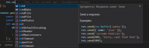
console.log(Object.getOwnPropertyDescriptor(obj, “a”));

This prints the property’s descriptor in our console window:

blog1

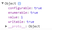
As you can see a property’s descriptor is itself an object with 4 properties. The obvious one is the value which is, like the name implies, the value set to the property (in this example obj.a).

The other three are the most important and the ones in need of further discussion. All you need to know is summarized in the following lists:

(defineProperty can be used to define a new property along with its metadata or modify an existing one provided that its descriptor’s configurable property is set to true)

Writable

  •  If set to true the value can be changed
  •  If set to false the value cannot be changed
    •  In non-strict mode any attempt to change the property’s value will fail silently
    •  In strict-mode any attempt to change the property’s value will trigger a TypeError

Let’s see some examples

var obj = {};

//We define a new property called 'foo' in obj with 'writable' explicitly set to true
Object.defineProperty(obj, "foo", {
	value: 100,
    writable: true
});

console.log(obj.foo);	//100;
//foo's value can be changed
obj.foo =  "foo";
console.log(obj.foo);	//'foo'

When we explicitly set ‘writable’ to false, the property’s value cannot be changed after the initial assignment.
The first example runs in non-strict mode while the second one is in strict mode and therefore the assignment of property ‘foo’ results in an error

Example #1: Non Strict Mode

var obj = {};

//We define a new property called 'foo' in obj with 'writable' explicitly set to false
Object.defineProperty(obj, "foo", {
    value: 100,
    writable: false
});

console.log(obj.foo);	//100;
//Assignment fails silently
obj.foo =  "foo";
console.log(obj.foo);	//100

Example #2: Strict Mode

"use strict"

var obj = {};

//We define a new property called 'foo' in obj with 'writable' explicitly set to false
Object.defineProperty(obj, "foo", {
	value: 100,
    writable: false
});

console.log(obj.foo);	//100;
//Assignment fails silently
obj.foo =  "foo";
console.log(obj.foo);	//Uncaught TypeError: Cannot assign to read only property 'foo'

Configurable

  • If set to true we can use Object.defineProperty to modify the property’s descriptor
  • If set to false we cannot use Object.defineProperty to modify the property’s descriptor
  • If set to false we cannot use’ delete’ to remove the property.
    •  In strict mode a TypeError is thrown.
    •  In non-strict mode the removal fails silently
  •  Exception: If set to false the only thing allowed to change is the writable status from true to false and not vice versa (TypeError thrown)

Example #3: Setting ‘configurable’ to false and then attempting to change ‘enumerable’ to false

var obj = {
	a: 1,
    b: 2,
    c: 3
};

Object.defineProperty(obj, "a", {
	configurable: false
});

Object.defineProperty(obj, "a", {
	enumerable: false	
});	//Uncaught TypeError: Cannot redefine property: a

Example #4: Trying to remove a non-configurable property using the ‘delete’ keyword (non-strict mode):

var obj = {
	a: 1,
    b: 2,
    c: 3
};

Object.defineProperty(obj, "a", {
	configurable: false
});

console.log(obj);	//{a: 1, b: 2, c: 3}
delete obj.c;
console.log(obj);	//{a: 1, b: 2}
delete obj.a;	//Fails silently
console.log(obj);	//{a: 1, b: 2}	(a is still here)

Example #5: Trying to remove a non-configurable property using the ‘delete’ keyword (strict mode):

"use strict"

var obj = {
	a: 1,
    b: 2,
    c: 3
};

Object.defineProperty(obj, "a", {
	configurable: false
});

console.log(obj);	//{a: 1, b: 2, c: 3}
delete obj.c;
console.log(obj);	//{a: 1, b: 2}
delete obj.a;	//Uncaught TypeError: Cannot delete property 'a'

Example #6: Setting ‘writable’ to false even when ‘configurable’ has already been set to false

Have you noticed that in Example #3 the property we tried to change after setting ‘configurable’ to true is the ‘enumerable’ property even though we haven’t talked about it yet? Well the reason why, is that there is an exception to what cannot be changed once configurable is set to false and that is when ‘writable’ is true. See the next example:

"use strict"

var obj = {
	a: 1,
    b: 2,
    c: 3
};

//We set configurable to false so theoretically we cannot change anything from here on
Object.defineProperty(obj, "b", {
	configurable: false
});

//You would expect an error but this operation completes
Object.defineProperty(obj, "b", {
	writable: false
});

obj.b = 120;	//Oops! Type error

If you run this piece of code you’re going to see that we managed to successfully make ‘b’ immutable even with ‘configurable’ set to false. And this is the one and only exception to the rule. Also note that if we try to change ‘writable’ back to true it won’t work as the exception is not bidirectional

Enumerable

  • If set to true the property is enumerable and will show up in a for .. In loop
  • If set to false the property will not show up in a for..in loop


Example #7: Omitting a property from the list of enumerables


function printEverything(obj){
	for(var prop in obj){
    	if(obj.hasOwnProperty(prop)){
        	console.log(prop + ": " + obj[prop]);
        }
    }
}

var obj = {
	a: 1,
    b: 2,
    c: 3
}

printEverything(obj);	//a: 1, b: 2, c: 3
Object.defineProperty(obj, "b", {
	enumerable: false
});
console.log("");
printEverything(obj);	//a: 1, c: 3

The most common use case scenario for modifying property descriptors will probably be when you want to create an immutable property. See the following example:

Example #8: Real life scenario: Immutable Property

var obj = {
	a: 1,
    b: 2
}

//We create a new property in 'obj' setting it to 18. That value cannot be changed. 'enumerable' set to true by default
Object.defineProperty(obj, "c", {
	value: 18,
    writable: false,
    configurable: false
});

console.log(obj);	//{ a: 1, b: 2, c: 18 }
obj.c = 5;
console.log(obj.c);	//18, No error, we're not in strict mode

That’s all for now. I will be coming back with another blog post discussing more stuff about property descriptors and how you can perform common descriptor operations faster with the use of methods like seal, freeze and preventExtensions. Until then.. Keep coding….